Discipline
Content design,
content systems, ad experience
Initiative I led
Founded the content design practice
and shipped the ad system on it
Partners
Product, engineering, ad sales,
legal, research
Surfaces shipped to
CTV, mobile, web
player states, settings, privacy
The starting point
I started with a high-distrust audience, a high-volume ad load, and no existing practice to build from.
I joined Crunchyroll as the only content designer in the entire organization, not just for ads but for every member-facing surface across the product. A Q4 2024 content discovery survey of 77 active members had already told us what we were working with: only 18% of members trusted the platform's recommendations. Eighty-nine percent required social validation before committing to something new. The survey also surfaced the top frustrations in open-ended responses: guidance and context were lacking, recommendations were not seen as trustworthy, and browsing the catalogue felt too difficult. These weren't ad complaints. They described the baseline state of the platform before a single ad decision had been made.
That distinction matters. Ad content design on a streaming platform is, at its core, a discovery problem. Every ad moment is a moment where the member's attention has been pulled from content they chose toward content they did not. Getting them back to the show, or getting them to genuinely engage with a promotion, requires understanding how they make content decisions in the first place. The discovery research did not ask about ads, and that's precisely what made it useful. It told us how members think about content before they have been asked to sit through advertising, which is the mental model they bring into every ad pod. Using it to ground ad content decisions wasn't a stretch, because it was the most honest evidence base available.
Worth noting: because this was independent research rather than a study commissioned to support the ad system, the findings were harder for stakeholders to dismiss. They didn't come from the ad team's assumptions about its own work. They came from members talking about their experience of the product as a whole.
The ad load was not small. Each episode included roughly 30 seconds of pre-roll followed by three mid-roll breaks of about 80 seconds each, which puts close to five minutes of ads inside a 23-minute episode. Inside each break, an ad pod of two or three ads runs back-to-back before the show resumes. Every piece of content I wrote sat inside that constraint, and every decision had to earn its real estate against a member who was already counting down.
There was no content practice, no design guidelines, and no precedent. I built the system, the surface-by-surface decisions, and the documentation from scratch. Alongside engineering and product, I worked across ad sales, legal, and research, a team that had competing priorities and clear opinions. The content decisions needed to hold under that pressure, not just make sense in a design file.
Phase 01: Pre-play
The first trust moment had to earn its keep, or the rest of the session never would.
When a member hits play, they expect to see what they chose. The SVOD promo runs instead, and a member who feels ambushed by it starts hunting for the exit before the first show frame has loaded. That's a trust violation built into the product architecture. Content design cannot remove it, only manage it. The question was: how do you earn the member's patience through a moment they did not choose, without making them feel manipulated?
The answer matters beyond the experience. A member who feels respected through the promo is more likely to stay through the pre-roll that follows, and more likely to sit through the mid-roll ad pods after that. Completion rates compound across the session. The SVOD promo is where session-level trust is established or lost, and trust is what determines whether the ad inventory holds its value.

SVOD Promo (in-player) · first frame before content starts
CTV · Mobile · Web
"Fans of My Hero Academia also like... Gachiakuta"
The framing borrows trust from the member's own fanbase, not from the platform's recommendation engine, which only 18% of members trusted.
Every content decision on this screen was made against the research and built to serve both the member and the business at the same time. The survey showed that 79% of members use story description to decide whether to watch something. The SVOD promo had to do that job in a compressed, trust-borrowing format, without the space a full series page gets.
Headline strategy
"Fans of X also like..."
89% of members required social validation before committing to new content, and 74% specifically wanted something similar to a previous favorite. This framing routes around the trust deficit entirely by doing both at once: it validates through the fanbase and signals similarity in the same phrase. The platform isn't recommending. The fanbase is.
CTA design
"Add to Watchlist" captures intent without demanding it
A hard conversion CTA at a trust-deficit moment fails twice: it does not convert, and it makes the member feel sold to. Watchlist capture collects genuine interest without demanding it, and that signal feeds the recommendation flywheel. After tapping, a confirmation shows and playback continues uninterrupted, so engaging with the promo carries no friction penalty.
Exit design
"Skip" as the primary action
Skip is the lead CTA, orange and prominent. Ad sales pushed for more friction on the exit path. I held the decision: a member who skips and feels respected returns. One who feels trapped does not finish the session. Respecting the exit is a retention argument.
Content as creative, and what makes it possible
The show's own visual does the promotional work
There is no separate ad banner. The full-screen character visual carries the promotion, but only because the social proof headline earns it first. Without "Fans of X also like..." the full-screen image is an interruption. With it, it is a recommendation. Sequence is the content design. The subtitle placement behavior was also specced at the point of design rather than as a handoff afterthought. On a CTV surface with rendering constraints, that distinction is the difference between a readable recommendation and an obscured one.
Phase 02: Core-play
The counter is a contract, and the skip carries the signal.
Once playback starts, ads run through GAM (the ad delivery service) and Velocity (the video player), two separate systems. My job was designing the content layer on top of both: the counter pattern, skip states, upsell placement, and the bridge copy that returns the member to the show.
The core principle: on surfaces where you cannot offer meaningful agency, transparency is the only honest trust signal available. The counter is the contract. When I tell a member "Ad 2 of 3," I have made a promise. Breaking it (through a miscount, a missing break, or a wrong total) is a trust failure that poisons the rest of the session.
The surface differences between CTV and web go deeper than interaction model. CTV is lean-back, with no cursor, no skip expectation, and completion rates already higher. Web is lean-forward, where a member at a keyboard has more perceived control, and withholding all agency at that moment creates more friction than it resolves. But explaining skip as a surface decision understates the actual logic. The skip on web functions as a conversion surface with a defined lifecycle. The member most motivated to upgrade is the member sitting through their first mid-roll break. That moment, peak frustration and peak conversion intent, is exactly when the skip should exist, and exactly when it should surface the upsell. Once the conversion window closes, the skip has done its job, and what follows is a different design problem entirely.
The hardest stakeholder conversation
Why CTV gets no skip button, and why that argument had to be won
No skip on CTV meant no upsell on CTV. No upsell meant no conversion path on our highest-reach surface. That was a real business cost, and the stakeholder pressure to add the skip button was real.
My argument: a skip button on a remote-control surface implies agency the member cannot meaningfully exercise. The interaction model does not support it. A member who sees a skip option they cannot easily reach, on a 10-foot UI with a remote control in the middle of an ad pod, does not feel offered a choice. They feel teased with one. That experience is more damaging to trust than no skip option at all.
On CTV, the counter is the trust signal. It is the only honest promise the platform can keep on that surface. On mobile and web, where the member has a thumb or a cursor and real agency, skip and upsell both appear because on those surfaces the promise is meaningful.

CTV · counter only, no false agency
LRX / TV
Content decision
Ad 1 of 2 with an 80-second orange countdown circle, positioned top-left where CTV eyes naturally scan. Two pieces of information, doing different jobs. The ad count sets scope: the member knows this is one of two, not an open-ended interruption. The countdown sets pace: 80 seconds, visibly moving, not abstract. Together they make the pod legible without a single word of explanation. No skip. No upsell. The counter is the only promise made on this surface, and it has to be kept exactly.
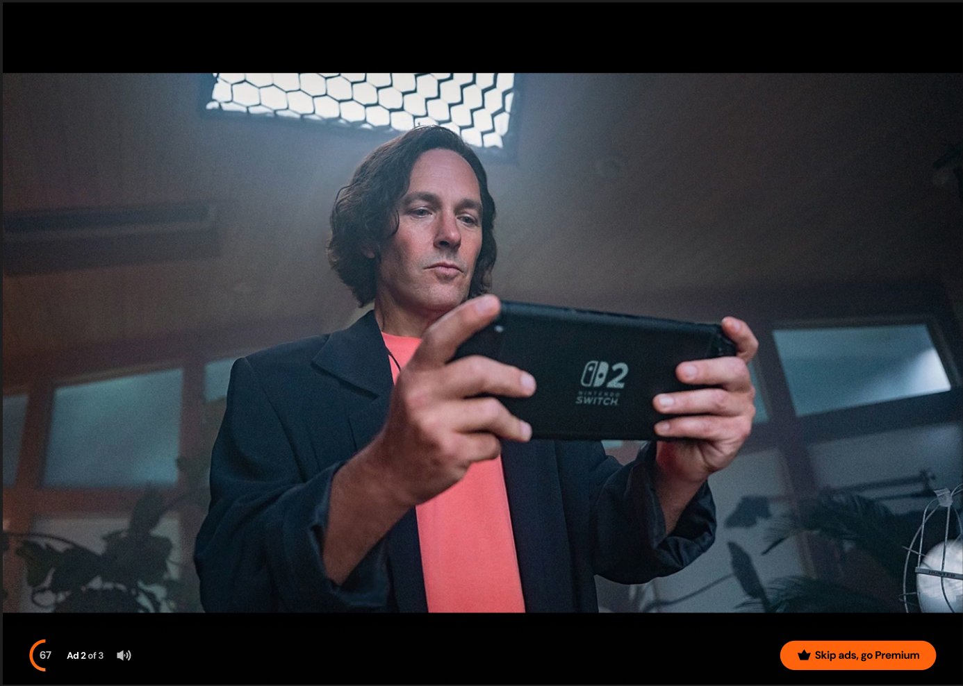
Web · counter plus agency plus upsell
Web
Word order is the content decision
"Skip ads, go Premium", not "Go Premium, skip ads." Member benefit leads. Business mechanism follows. Reverse the order and it reads as a sales pitch with a reward buried inside it. This order reads as agency with a path available.
Member state signal system
Why the skip exists, when it exists, and when it stops.
The objective of the ad platform is to sustain the conditions under which members remain willing to watch ads across sessions. A member who cancels or downgrades generates zero inventory. The content system has to serve completion rates and tier retention simultaneously, and those two goals require different responses at different points in the member lifecycle.
The table below maps member state signals to content decisions. CTV holds constant across all states because the interaction model and lean-back behavior make the progression unnecessary. Web and mobile adapt because the member's relationship to agency on those surfaces changes as they move through the lifecycle.
| Member state |
Signal |
CTV |
Web / Mobile |
Business logic |
| New member |
First session on ad tier. Just signed up or downgraded. |
Counter only
Ad 1 of 2 · 80s |
Counter + Skip + Premium upsell
"Skip ads, go Premium" |
Peak upsell intent. The highest-friction, highest-conversion moment. The skip creates the surface. The upsell captures the intent. The counter sets expectations if neither happens. |
| Adjusting |
Sessions 2 through 7. Member did not upgrade. Still building tolerance. |
Counter only
Ad 1 of 2 · 80s |
Counter + Skip
No upsell pill |
Conversion window closed. Repeating the upsell to a member who already declined creates resentment. Skip stays to support adjustment. Removing it now would spike churn risk before the member has accepted the exchange. |
| Established |
Session 8 and beyond. Member has accepted the ad-supported exchange. |
Counter only
Ad 1 of 2 · 80s |
Counter only
Web converges with CTV |
Member has accepted the value exchange. Skip no longer needed. Web and CTV now hold the same contract. Completion rates stabilize. Inventory value is protected. |
| CTV (all states) |
Lean-back surface. No cursor. Remote navigation. No skip expectation established by the format. |
Counter only
Constant across all lifecycle stages |
N/A |
CTV completion rates are inherently higher on lean-back surfaces. Adding skip would create a false agency problem: a button the member cannot easily reach, which creates frustration rather than resolving it. Counter is the only contract that matters here. |
The skip is a tool with a lifecycle, calibrated to drive Premium conversion when conversion is possible, and completion rates when it isn't. Both outcomes serve the same north star: a member who stays on the ad tier long enough to generate ongoing inventory value.
The business logic behind the member state signal system.
Counter placement
Top-left on CTV, bottom-left on web
The same content pattern, placed where each surface's eyes already scan. CTV attention anchors top-center. Web and mobile media controls live at the bottom. Counter placement is a surface-specific content decision, not a visual one. The pattern is consistent. Where it lands is not.
Ad break bridge
"[Title] continues after ads"
Four to six words hold the member through a full ad pod. On CTV, where a member has been passive for up to 80 seconds, this is the only signal before playback resumes. If the title is wrong or the copy is missing, the member assumes something broke. These words carry the weight of the entire mid-roll relationship.
Documentation
I mapped every ad moment, surface, and content response.
Before writing a single word of copy, I mapped the complete player state as a sequence flow: from playback request through entitlement check, SVOD promo, ad pods, dub card, and end slate. Every decision node, every branch condition, every terminal state. The map made the content design problem legible to engineering, product, and legal without requiring a separate conversation for every edge case. It also made the scope of the work visible in a single view, which mattered for stakeholder alignment in an organization where no one had done this before.
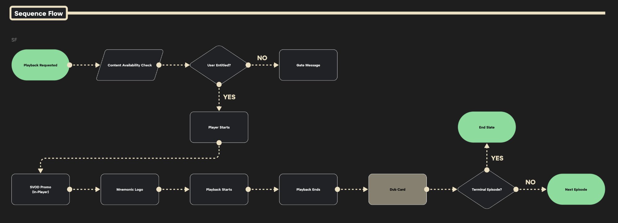
Sequence flow · full playback journey · all surfaces
Systems documentation
What the flow maps
Every state a member can be in, before and after playback
The flow starts at Playback Requested and branches immediately: is the user entitled? If no, Gate Message. If yes, Player Starts. From there the happy path runs through SVOD Promo, Mnemonic Logo, Playback, Dub Card, and the terminal episode decision that routes to either End Slate or Next Episode. Each node is a surface. Each surface is a content design problem. The map makes the sequence of those problems visible before any copy is written.
Why this document existed
Shared language for a team that did not share assumptions
Engineering understood the flow as a technical state machine. Product understood it as a feature set. Legal understood it as a set of disclosure obligations. None of those mental models were wrong, but they were different enough that a copy decision made in one frame could create a compliance problem in another. The sequence flow gave every team a single artifact to reference, which meant disagreements happened at the map level rather than in late-stage implementation reviews.
The gate taxonomy (6 gate types across 4 surfaces) was a direct output of the mapping process. Gates are the moments where the member cannot proceed without taking an action or being redirected. Naming them, categorizing them, and documenting the content response for each one meant that when a new gate state appeared during development, the team had a framework to drop it into rather than solving it from scratch each time.
| Phase |
Ad moment |
Member state |
Web |
Mobile |
CTV / LRX |
Trust signal |
| Pre-play |
SVOD Promo |
Hit play, expected content. Session-level trust being established. |
Social proof headline + watchlist + skip
Trust-critical |
Same. Skip reachable by thumb.
Trust-critical |
No easy exit. Every word carries full trust load.
Trust-critical |
Social proof framing, low-commitment CTA, honest exit |
| Pre-play |
Gate message |
Not entitled. Blocked before playback starts. Highest frustration risk. |
6 gate types, each with distinct copy and a distinct resolution path.
Frustration moment |
Same as web. |
Profile restriction surfaces a switch-device instruction.
Frustration moment |
Clear reason for gate, clear resolution path, no dead ends |
| Core-play |
Pre-roll |
Chosen to watch. Ad runs before the reward lands. |
Ad X of Y, bottom-left. Skip ads, go Premium.
Agency + upsell |
Same. Thumb-zone skip CTA. |
Ad X of Y, top-left. Counter only. No false agency.
Counter only |
Position + total, countdown visible, promise is kept |
| Core-play |
Mid-roll ad pods ×3 |
Interrupted at peak emotional engagement. Highest disruption point in the session. |
Skip CTA has its highest conversion potential here. Member is most motivated to exit. Counter holds those who stay.
Peak disruption |
Touch skip is most valuable. Copy must hold the member through the full pod, not just one ad.
Peak disruption |
No skip. Counter is the only promise. A wrong count breaks session trust completely.
Counter = contract |
Disruption recovery, bridge copy reconnects member to the narrative |
| Core-play |
Ad break bridge |
Between the last ad and content resuming. Member deciding whether to stay. |
"[Title] continues after ads." Show title plus resume signal.
Continuity signal |
Same. Terminal-episode bridge can surface next-episode context. |
Most critical here. After 80 seconds of passive viewing, this is the only signal before playback resumes. If wrong, the member assumes the stream broke.
Trust-critical |
Series title, resume signal, low words, high stakes |
| Post-play |
Dub card |
Post-episode. Next-content decision beginning. Language preference visible. |
67% of members use language availability as a deciding factor when choosing what to watch. Wrong signal here creates post-play frustration before the next session begins.
Discovery signal |
Same. |
Surface-specific behavior documented; in progress at handoff. |
Language clarity, correct expectation-setting before next commitment |
| Post-play |
End slate |
Terminal episode. Highest-intent discovery moment in the session. |
54% of members seek new content right after a series ends. The end slate is the highest-value real estate in a session.
Peak discovery intent |
Touch affords richer discovery across genre, similar titles, and watchlist.
Peak discovery intent |
Lean-back mode. Content must surface without requiring the member to search.
Lean-back discovery |
Flywheel closes, trust exchange pays off, next session begins here |
Phase 03: Post-play
Here's where the exchange pays off.
Fifty-four percent of members sought new content immediately after finishing a series, making the post-completion moment the single highest-intent discovery touchpoint in any session. It is also where the flywheel closes.
The survey gave us something more specific than the raw percentage: 61% of those members wanted something with similar story or themes, and 51% wanted something from their own watchlist. That means a generic recommendation at the end slate is a missed opportunity even when it lands. The content design decision on that surface is to surface the right signal in the right order: watchlist first, then similarity, because both are validated by the member's own behavior rather than the platform's algorithm.
A member who saw a relevant SVOD promo, added it to their watchlist, sat through mid-roll ad pods, and arrived at the end slate has demonstrated intent at every stage. The end slate serves them the next show. The exchange is complete: they gave attention, they got content, and trust held through the whole transaction.
The flywheel only closes if every earlier stage earned it. The promo earns watchlist signal. The counter earns patience through the pod. The bridge earns the return to content. The end slate earns the next session. If any stage breaks trust, the flywheel stops, and when the flywheel stops, so does the inventory value of everything that follows.

End slate · post-completion · Web
Phase 03: Post-play
Headline: two jobs, five words
"All caught up! What's next?"
"All caught up" lands before the ask. It acknowledges what the member just did before pivoting to what they might do next. Reversing it ("What's next? You're all caught up") loses the emotional beat and reads as transactional. Sequence is the content decision: earn the moment before spending it.
Similarity signal
"Similar to what you just watched"
61% of post-completion members want something with similar story or themes. This label does not try to sell the show. It explains the selection logic quietly, below the title, as a rationale rather than a headline. The show sells itself. The label earns trust by naming why it was chosen.
Primary CTA
"Play S1 E1"
Not "Watch Now." Not "Start Watching." The specific episode removes every friction step between decision and action. The member decided at the title level, and the CTA executes immediately. No series page detour, no episode picker, no ambiguity about where playback begins.
Metadata line
Rating · Language · Genre, genre, genre, genre
79% of members use story description to decide. 74% use genre and subgenre. 67% use language availability. All three signals are present in a single metadata line before the member touches anything. The line is the condensed decision support the research said members needed.
Carousel scope
1/6 navigation indicator
Six options are available. The member is on the first. The scope indicator matters because an unnumbered carousel feels infinite and arbitrary. A numbered one feels curated. The member knows they have five more options if this one does not land, which lowers the stakes of the first recommendation and keeps them in the surface rather than leaving it.
The ad experience is an exchange. Content design determines whether the exchange feels fair, and a fair exchange is what makes the ad inventory worth buying.
The principle behind every content decision in this system.
Privacy and consent
I made the privacy controls feel like product features.
Being the only content designer in the organization meant the ad experience did not exist in isolation. Every decision I made in the player had to be consistent with what members encountered in account settings, in onboarding, and in the privacy controls that governed how their data was used for advertising. The Data and Privacy screen was one of the highest-stakes surfaces I owned, not because members visited it often but because every word on it was load-bearing. Legal compliance, advertiser capability, and member trust were all sitting on the same page.
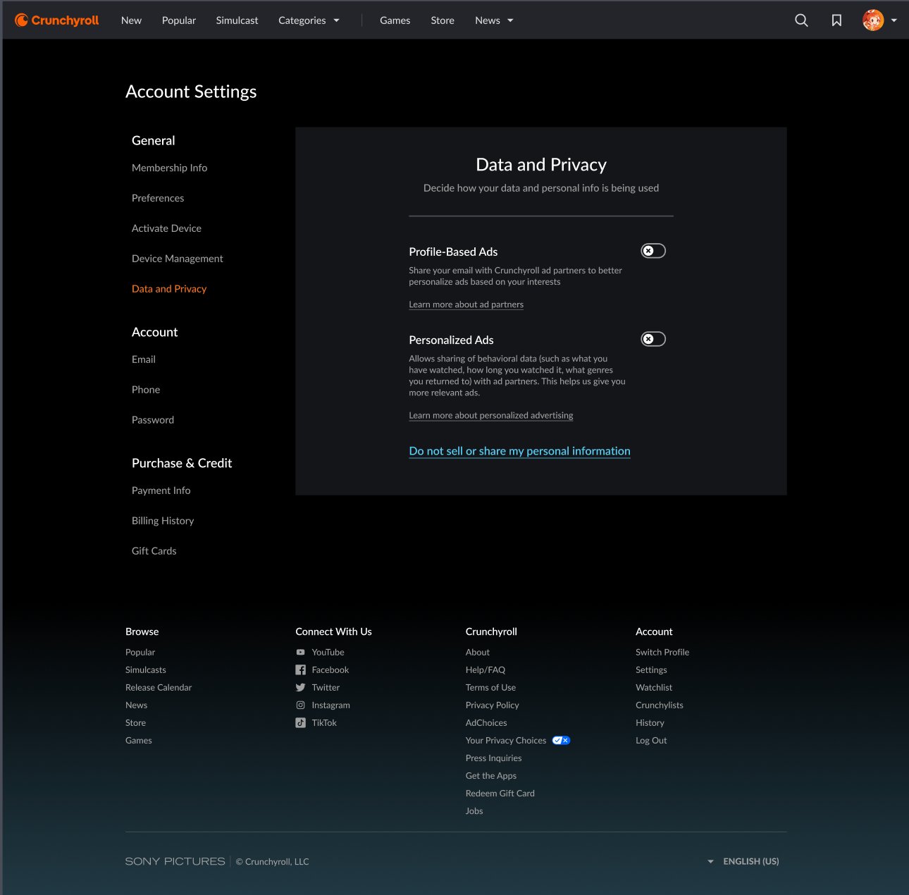
Account Settings · Data and Privacy · web
Privacy and consent UX
Privacy controls that are hard to find signal that the platform is not confident in what it is asking. Controls that are easy to find signal the opposite.
The navigation placement decision behind Data and Privacy.
Decision 01 of 05
Navigation placement: General, not Account, not a standalone Privacy section.
"Data and Privacy" sits fifth under the General navigation group, after Membership Info, Preferences, Activate Device, and Device Management. That position was deliberate. Placing it under Account (alongside Email, Phone, and Password) would have framed it as administrative and potentially alarming, a legal compliance checkbox rather than a member setting. Placing it under General alongside Preferences frames it as something the member controls as part of how they use the product.
The hierarchy communicates: this matters and we are not hiding it, but it is not an emergency. Members who want to find it can. Members who are not looking for it are not made anxious by its prominence. That balance required a navigation architecture argument, not just a content decision. It also required legal sign-off that the placement met disclosure obligations without requiring it to be the first thing a member sees.
Decision 02 of 05
Default states: both toggles off, opt-in rather than opt-out.
Both Profile-Based Ads and Personalized Ads ship with their toggles off. This is the single most consequential content design decision on the screen, because of what default states communicate at scale. An opt-out default says: we assume your consent. An opt-in default says: we will ask for it.
For a member base where only 18% trusted platform recommendations, opt-out would have been a trust catastrophe. The business case for opt-out is real: higher participation rates in behavioral targeting means richer audience segments, which means higher advertiser CPMs. The content design argument against it is also real: a member who discovers they were opted in without asking is not a member who stays opted in. The default state is a retention decision dressed as a privacy decision.
Decision 03 of 05
Toggle hierarchy: email identity before behavioral data.
Profile-Based Ads leads. Personalized Ads follows. Profile-Based uses email identity matching, meaning the member already knows they gave Crunchyroll their email. Personalized Ads uses behavioral data: viewing history, genres watched, time spent. The more concrete and already-understood data type leads. The more abstract type follows.
This is a progressive disclosure decision applied to a consent surface. Starting with the familiar lowers the cognitive load before the member encounters the unfamiliar. If the order were reversed, with behavioral data first and email second, the member would have to process a more abstract concept before they had context for what kind of data the platform was even talking about.
Decision 04 of 05
Terminology: plain language for the ask, legal language where required.
The page title is "Data and Privacy" rather than "Ad Preferences" or "Privacy Settings." Broader framing, more honest, less optimized for advertiser framing. The subtitle, "Decide how your data and personal info is being used," opens with a verb that gives the member agency. The member is deciding, not configuring.
For Profile-Based Ads, the description names exactly what is being shared ("your email"), exactly who receives it ("Crunchyroll ad partners"), and what it produces ("ads based on your interests"). Three specific answers to the three questions a member has when they see a toggle they do not understand. This was the result of working closely with legal to translate compliance requirements into plain language without losing their legal meaning.
"Do not sell or share my personal information" at the bottom is CCPA-required copy, legally mandated verbatim language. It is also the only phrase on the screen that a member cannot act on without already understanding what it means. It reads as a declaration rather than an action. That tension is where legal requirements and member clarity genuinely conflict, and the resolution here was to isolate the legal language at the bottom of the screen, visually separated from the plain-language controls above, so it reads as a reference rather than the primary ask.
Decision 05 of 05
Where legal and member clarity were in tension, and how those negotiations went.
The two toggle labels ("Profile-Based Ads" and "Personalized Ads") were not the first versions legal and I agreed on. The original legal drafts used terms like "targeted advertising" and "interest-based advertising," which are accurate within the industry but meaningless to a member who has never worked in adtech. My initial push was for labels that named the data type directly: "Email-Matched Ads" and "Behavior-Based Ads." Legal's concern was that these were not established terms in their disclosure framework, and that introducing non-standard labels could create ambiguity in a regulatory context.
The resolution was a negotiated middle: labels that were plain enough for members to read without a glossary, but stable enough for legal to defend. "Profile-Based" anchors to identity. "Personalized" anchors to behavior. They are still closer in meaning than I would have chosen without legal constraints, and a member scanning quickly might not register the difference at the label level. But that is what the descriptions are for, and the description-level work is where I was able to win the plain-language argument more completely.
The Personalized Ads description in the first screenshot read "Allows sharing of behavioral data with ad partners." Legal owned that language and treated "behavioral data" as a defined term. My argument was that defined terms belong in privacy policies, not in product UI. I pushed for language that named what behavioral data meant in practice: what the member had watched, how long they watched it, what genres they returned to. The updated version, visible in the screenshot, reflects that negotiation. The category term ("behavioral data") is gone. The actual content is there instead. Legal signed off because the plain-language version was, if anything, more accurate than the category term, and accuracy was their primary concern.
This is what content design work inside a legal constraint looks like. The work is building enough trust with legal to make the plain-language argument on its merits, iteration by iteration, until the copy on screen serves members without creating compliance risk for the company.
What legal partnership made possible
Compliance as a content design constraint
Getting to plain language on a privacy surface requires legal to trust that plain language still meets disclosure obligations. That trust is built through iteration. Every description on this screen went through legal review. The plain-language versions I pushed for were not the first drafts legal saw. They were the result of multiple rounds in which I argued for member clarity while legal argued for precision, and the final copy reflects both. The CCPA link is where precision won. The toggle descriptions are where clarity did.
Why this screen connects to the player
Consent and the ad experience are one system
A member who turns off Profile-Based Ads or Personalized Ads will still see ads. What changes is which ads they see and how targeted those ads are. The content design challenge is making that distinction clear on the settings screen, so that members who encounter less relevant ads in the player understand why and don't experience it as a product failure. The settings screen and the player experience are one trust system, not two separate surfaces. Designing them as separate would have created a gap that support tickets would have filled.