Living Room Rebrand·Content Systems·Localization·13 min read
A rebrand built on systems.
A ground-up rebrand of Crunchyroll's TV experience for 25+ markets. I shaped the manga-illustrated visual direction from concept reviews onward and authored the content systems beneath it: taxonomy, metadata hierarchy, localization framework, measurement rubric. Six artifacts. Five teams adopted them.
ByMohammed RazaSenior Content Designer · Practice Lead
1
Founding vision, greenlit by CEO + leadership
4
Module families codified into the taxonomy
25+
Markets running on one bilingual welcome system
6
Practice artifacts shipped, adopted by 5 teams
My role / 01
Visual direction, co-shaped
From the earliest concept reviews with the Senior Principal Designer and brand team. Influenced the manga-illustrated direction, argued for Hime as the AI search character.
My role / 02
Content practice lead
Authored the four-bucket taxonomy, metadata hierarchy, and editorial-versus-dynamic rule set that matured the content function org-wide.
My role / 03
Localization framework
Owned the bilingual welcome system, Tokyo-anchored salutation matrix, and 25+ market spec downstream surfaces inherit.
My role / 04
Measurement & adoption
Built the data partnership with Content Engagement. Drove practice-artifact adoption across 5 internal teams.
The brief
Anime was going mainstream and Crunchyroll's home was a soulless play button for one show. I co-shaped the rebrand from the earliest concepts and built the content systems beneath it.
The diagnosis
Members watched their anchor show and canceled at the finale. The home gave them no second show. Editorial picks, algorithmic recommendations, and live events shipped as the same horizontal rail. The surface read as soulless catalog inventory at the exact moment Netflix, Hulu, and Amazon were licensing anime, and the content function had no shared artifacts that could travel to a second surface anyway.
What I built
A four-bucket module taxonomy (editorial, behavioral, algorithmic, time-bounded), a Tokyo-anchored bilingual welcome system, a metadata hierarchy with restraint rules for video-playing surfaces, and a measurement rubric so each module family had its own performance axis. Six artifacts in total, designed to travel beyond the rebrand itself.
What it did
Manga-forward direction and Hime as AI search character cleared executive review. Five internal teams adopted the artifacts as operating-system pieces for their own work. The bilingual welcome system runs across 25+ markets, and the data team can finally answer whether editorial is outperforming the recommender.
Senior Principal Designer
Co-shaped the manga-illustrated direction from concept reviews. I argued for the cultural specificity that defined the rebrand and authored the content layer that carried it across surfaces.
Brand
Co-developed the visual identity and aesthetic from concept reviews onward. I led the cross-team workshops that pulled brand voice into product copy.
UX Research
Surfaced the parasocial Hime signal and JST mental model. I translated findings into the search-character framing and the Tokyo-anchored welcome system.
Content Engagement
Operationalized the four-bucket taxonomy I authored as their collection-logic spec. Adopted the per-module measurement rubric I co-built with their data team.
Editorial
Adopted the editorial-rail rules I authored end to end (Featured 10, Editor's Pick, Just Dropped, Award-Winning, Must Watch).
Engineering
Built field-spec implementation against documentation I authored for welcome, modules, metadata, and fallback behaviors.
The diagnosis
Crunchyroll's TV experience was a soulless play button while anime was going mainstream.
Members searched their anchor title, watched it episode-by-episode, and canceled when the finale dropped. The home gave them no second show. Netflix, Hulu, and Amazon were licensing anime catalogs that would catch the same audience inside two product cycles. Three problems were the cause.
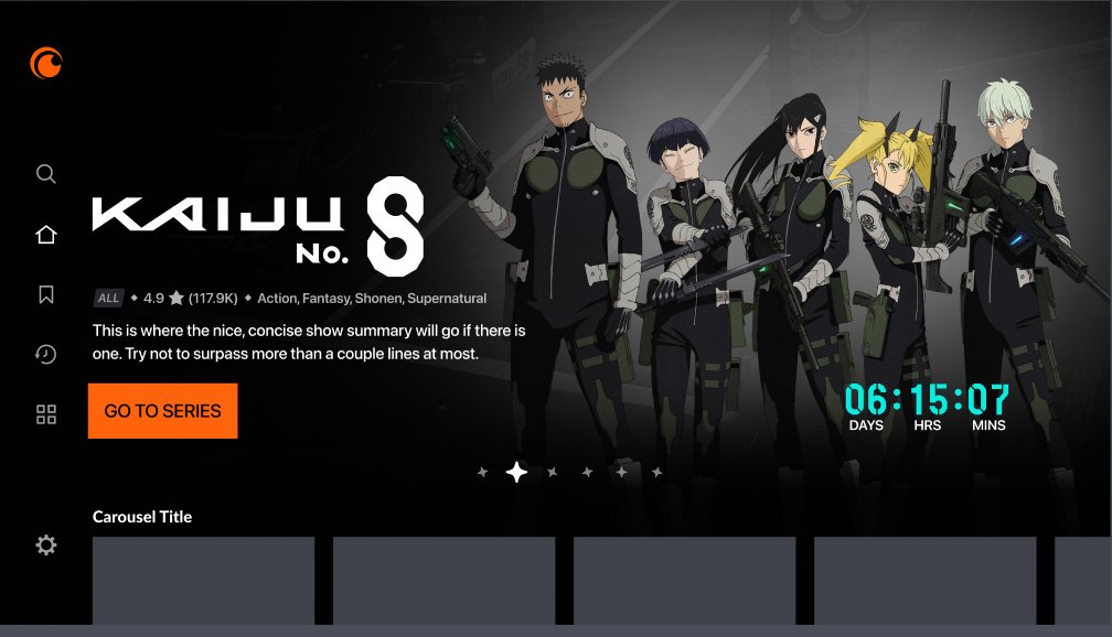
The design was outdated. Placeholder strings like "Carousel Title" were shipping to production, the six-item nav mixed account management with discovery, and the tile sizes and rail rhythm had never been rethought for 10-foot scan distance. The visual language predated every other surface in the company's roadmap.
The content was soulless. Module names read like inventory categories, with no editorial voice, no fan grammar, and no celebration of the fandom that paid for the catalog. The surface read as a generic streaming app that happened to host anime, which is exactly what Netflix and Hulu were positioning to become.
The product did not drive multi-show adoption. Members opened the app for one title, watched it episode-by-episode, and left when the finale dropped. The home never earned a second show, which is the only thing that holds an anime fan past a season.
RESEARCH SIGNAL · UXR diary studies + product analytics · 2022 — 2023
─────────────────────────────────────────────────────
DOMINANT MODE      open app  /  search anchor show  /  play  /  exit
CROSS-RAIL NAV     small share of session traffic; rails were scrolled past, not into
TITLE SHARE        majority of session time concentrated on one title per member
POST-FINALE        elevated cancellation pressure inside the season-finale window
COMP LANDSCAPE     Netflix, Hulu, Amazon licensing anime through 2022 — 2024;
                   catalog access alone would not hold the audience much longer

IMPLICATION        the work was turning a soulless play button for one show
                   into a discovery surface a fandom would defend
Fig. 01Before / hero. "Carousel Title" placeholder shipped to production
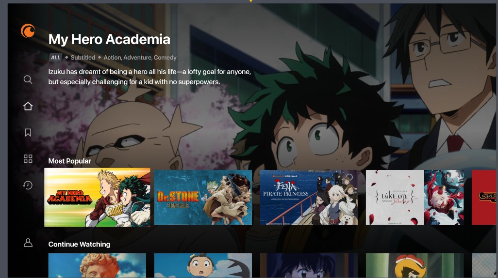
Fig. 02Before / rails. Editorial and algorithmic look identical
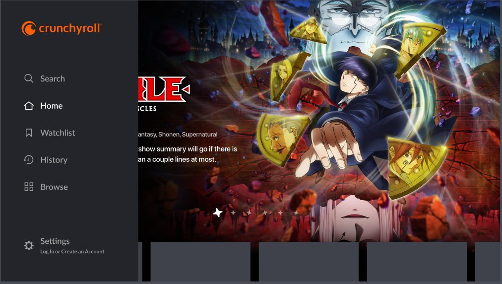
Fig. 03Before / navigation. Six items, account management mixed with discovery
Four gaps stood between what was shipping and what the audience needed.
Speak fluent fandom. No Japanese cultural threading, no simulcast acknowledgment, no vocabulary signaling the team had ever met an anime fan. UXR diary studies showed members translating to Japan Standard Time when discussing release schedules and using sub-versus-dub as a primary identity marker. The product surfaced none of that vocabulary.
Distinguish content types. Editorial picks, algorithmic recommendations, behavioral state, and live events all shipped as the same horizontal rail. Information architecture principle was being violated at the rail level: four content types with four different obligations to the user, treated as one.
Carry executive defense. The proposed redesign was visually strong with no system underneath. A CEO review on global scalability needed a content layer that explained how cultural specificity could travel across 25+ markets without becoming exoticized in some and underwhelming in others.
Travel as a practice. The content function had no shared artifacts: no taxonomy, no metadata schema, no voice principles, no measurement model. Whatever shipped on TV would not generalize to mobile, web, or future surfaces.
The visual rebrand and the content systems moved together because the visual decisions could not survive review without the systems underneath. Aesthetics without architecture is a per-market reinvention problem the moment localization picks up the work.
A streaming service that licenses anime is not the same product as a home for anime fandom. The TV experience treated us like the first thing.
Reframe I brought into the first vision review / Q3 2022
The approach
Three moves would make the surface fluent and the practice durable enough to outlast the rebrand.
The vision had to clear the executive room, hand engineering a system to populate, and leave the content practice with shared artifacts that did not depend on the rebrand to keep working. Three moves, each accountable to all three audiences.
Move 01 / The cultural fluency had to be structural, not decorative.
Embed Japanese cultural moments at the system level, not as decoration. UXR had documented two behaviors that pointed at the same conclusion:
JST mental model. Members translated release times to Japan Standard Time when discussing simulcasts in forums and Discord.
Sub-versus-dub identity. Members used it as a primary identity declaration before any other preference.
The surface needed a Japanese cultural anchor that was load-bearing, not ornamental. The welcome screen became the proof point.
Every rail looked identical because there was no shared vocabulary for what a rail was. Library science calls this a flat hierarchy: every item at the same level, no relationships expressed. Editorial picks, algorithmic recommendations, behavioral state, and live events each carry a different contract with the user, and a flat hierarchy hides the contract.
Four buckets, derived from the actual obligations each rail owed:
Editorial. A human curated this.
Behavioral. You did something; the system is reflecting it.
Algorithmic. The recommender chose this.
Time-bounded. This is happening on a schedule.
Each carries its own iconography, copy patterns, and rules for when a content engineer swaps copy dynamically versus when an editor writes it. Shared vocabulary is what unlocks operational velocity at scale.
Move 03 / Hime became a search character with personality.
UXR's parasocial-relationship study showed members spoke to and about Hime in ways no member spoke about Netflix or Hulu mascots. The signal was strongest when fans recommended shows to each other, weakest when fans searched for something specific. AI search was about to ship as a generic voice interface.
The research and the timing argued for the same conclusion: search needed a familiar voice the audience already trusted. The manga-illustrated direction gave Hime a coherent place to live, so the character was not an afterthought tile in a ribbon.
Manga-forward visual direction with Japanese cultural threading at the system level.
Why I argued for it
A neutral aesthetic concedes the cultural moat. Cultural specificity is what scales when the taxonomy lets every regional surface populate within the same system.
Pushback
Will it scale? Will it read as exclusionary in markets where the audience is broader than core fandom?
My answer
Vague aesthetics force per-market reinvention. Specific aesthetics with a strong taxonomy do the opposite.
Outcome
Direction approved. Taxonomy artifact became part of how the team defended the bet inside subsequent leadership conversations.
The system
The system was a four-bucket taxonomy and the rules that held it together.
Vision pitches buy permission. Systems are what ship. The bulk of the work was authoring the content layer that let the new aesthetic do real operational work across 25+ markets, and codifying it as artifacts other teams could pick up and run with.
The system rests on five content principles.
Before the modules, the metadata, or the strings, the system needed a shared set of decisions about what good content looked like in this product. Five principles, each derived from a specific research signal or operational constraint:
Cultural specificity over neutrality. The audience already self-identifies with Japanese conventions (sub vs dub, JST time, romaji terminology). Specificity is the moat. Neutrality concedes it to streaming competitors who treat anime as catalog rather than culture.
Fan grammar over marketing grammar. Fans say "S1 E20" and "shortly after Japan." Marketing says "Season 1, Episode 20" and "same-day simulcast." The product copy uses the audience's grammar, not the org's.
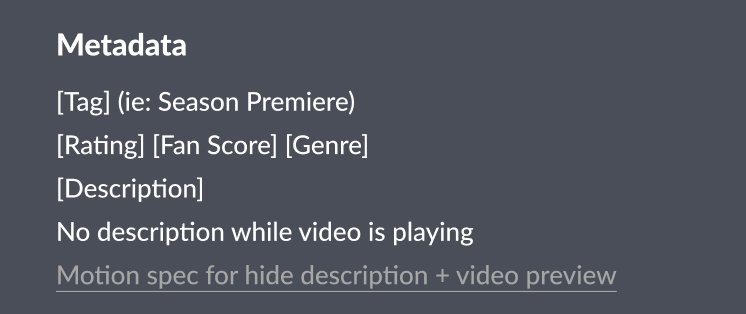
Restraint while moving image plays. Description copy on top of a video preview competes with the show for attention. The motion sells the show; the copy steps back. Tag, rating, and CTA only.
Intent legibility per rail. A user looking at a rail should know within one glance whether a human picked it, an algorithm picked it, the system is reflecting their behavior, or something is happening live. The taxonomy is the legibility mechanism.
Localization-readable defaults. Every string has a documented source (system, editor, recommender), a documented length budget, and a documented behavior on overflow. Localization should never have to reverse-engineer a copy decision.
Every rail, every module, every microcopy choice in the rest of this chapter was checked against these five before shipping.
The entry flow had to set cultural identity before the home loaded.
Login, profile picker, and welcome run before any content surface appears, which makes them the most expensive content design real estate in the experience: every member crosses them, every session, before reaching anything else. They are also what gets cut first under deadline pressure.
The argument for shipping them in lockstep with the home was load-bearing, not nice-to-have:
The home explains what Crunchyroll is now.
The entry flow explains who Crunchyroll thinks the user is.
The second is the prerequisite trust signal for everything downstream.
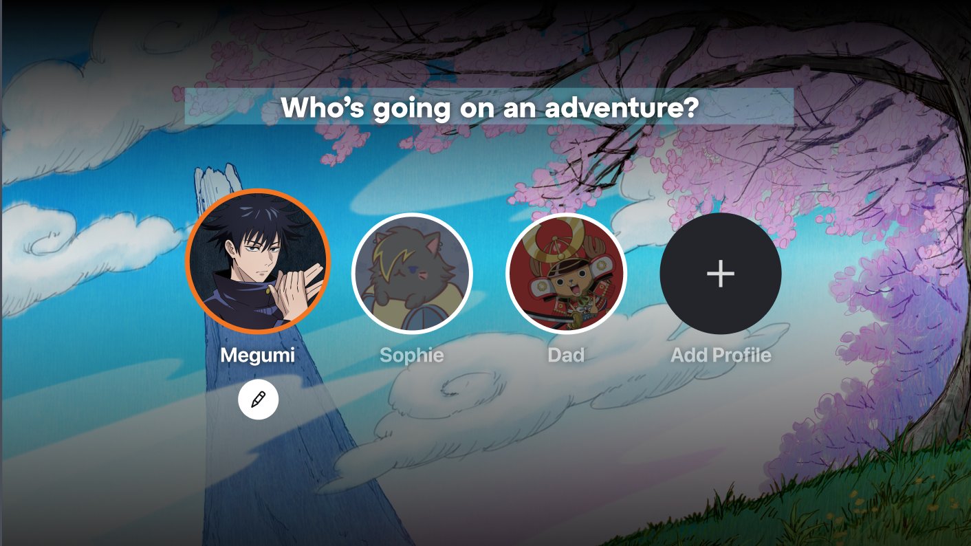
Fig. 05Profile picker / shipped state. "Adventure" pulled from brand voice into product copy
Marketing wanted
Who's watching?
Recognizable. Identical to every competitor.
What I shipped
Who's going on an adventure?
Specific to fandom. Continuous with brand voice.
Resolution came out of a copy workshop with brand. They were already using "adventure" in campaign work. Pulling "adventure" into product copy was the cross-pollination move that made brand voice travel into the surface. Profile names follow fandom logic too. Megumi is a character. Sophie is a person. Dad is a household role.
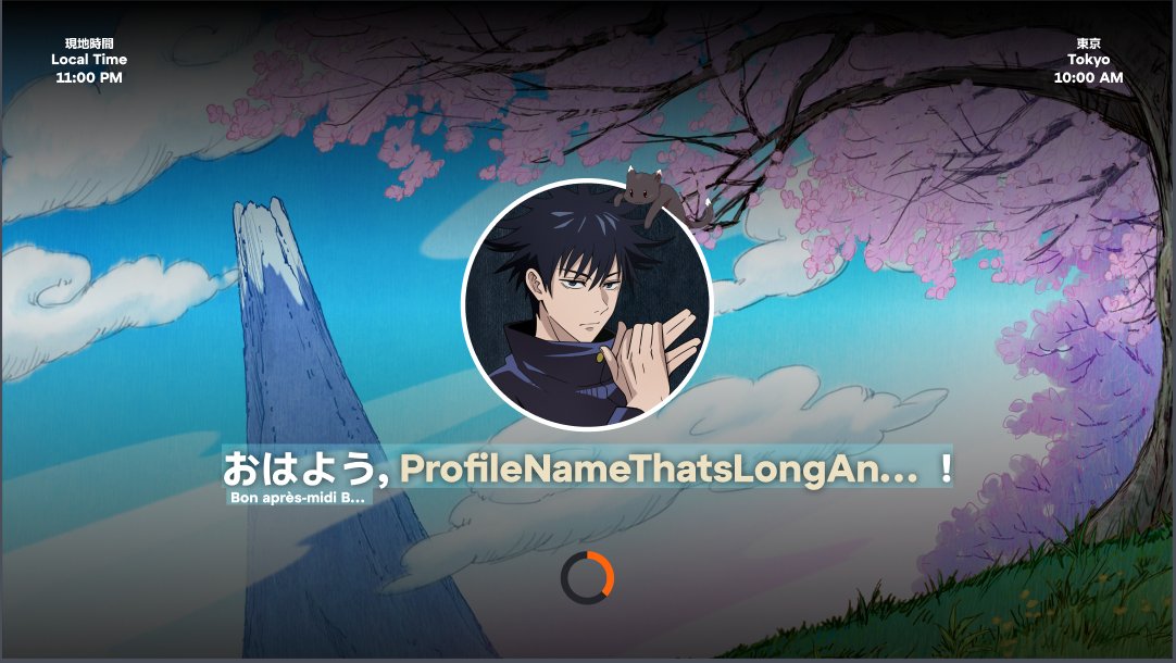
Fig. 06Welcome screen / shipped state. Tokyo-anchored salutation, three language layers
What shipped on the welcome screen
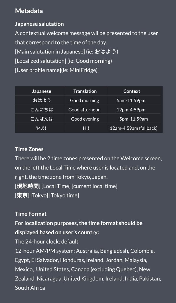
Three decisions shipped together, each with research underneath: a contextual Japanese salutation tied to Tokyo time, a dual-clock that pairs user-local time with Tokyo, and a locale-translated secondary greeting. The dual-clock stops feeling decorative the moment a fan checks before bed to see if their show has aired in Japan yet.
The contested rule: Tokyo time anchors the greeting
Engineering wanted the device's local clock because the implementation was straightforward, but UXR had documented something the product team had not noticed: members were already translating to JST when discussing simulcasts in forums, Discord, and r/anime. The mental model existed in the audience and the surface had simply never reflected it.
Shipped behavior anchors the salutation to Tokyo time, with the device's local clock still in the corner. The salutation belongs to Japan because that is where the schedule lives, and the timekeeping belongs to the fan because that is where the body lives.
Why the register is casual
The four chosen forms (ohayou, konnichiwa, konbanwa, yaa) are casual rather than formal because UXR's diary studies showed members used casual romaji freely in fan contexts and read formal Japanese as marketing distance. Casual register reads as a member-to-member greeting; formal would have read as a brand-to-customer one. The "yaa" late-night band exists because anime watching peaks between midnight and 5am JST in fan communities, and the absence of a greeting in that band would have read as the surface being asleep when the audience was most awake.
WELCOME STRING SPEC · v1.2 · shipped Q1 2024
─────────────────────────────────────────────────────
PRIMARY    {japanese_salutation}, {profile_name}!
SECONDARY  {locale_greeting} {profile_name_short}

SALUTATION  bound to Tokyo timezone (JST), casual register
            ohayou      05:00 / 11:59 JST   (morning)
            konnichiwa  12:00 / 16:59 JST   (afternoon)
            konbanwa    17:00 / 23:59 JST   (evening)
            yaa         00:00 / 04:59 JST   (late-night)

TRUNCATION  primary    @ 22ch + ellipsis  (10-foot scan distance)
            secondary  @ 14ch + ellipsis  (sub-line, half-weight read)
            japanese   never truncated    (cultural anchor; full or omit)

TYPOGRAPHY  display weight on japanese salutation (visible as character)
            display regular on profile name
            mono small-caps on secondary greeting (locale tag)
Why the truncation budgets are what they are
Twenty-two characters on the primary line came from a 10-foot UI legibility test at the smallest target TV size (40-inch 720p). At that distance, a primary-line glyph needs roughly 1.6% of horizontal pixels to read. Twenty-two characters of mixed Japanese and Latin script fill the legibility budget without crowding the next line.
Fourteen characters on the secondary line is the half-weight read: present, scannable, never the thing the eye lands on first.
The Japanese salutation is exempt from truncation. A half-truncated romaji greeting reads as a typo, not a localization decision. If the layout cannot fit the whole salutation, the system falls back to the secondary greeting alone.
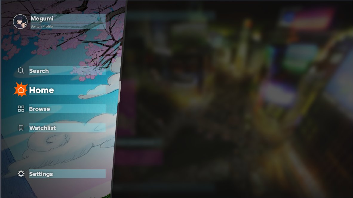
I cleared the navigation before designing the home.
Six items mixing account management with discovery taxed cognitive load on a TV remote. I worked peer-to-peer with the Senior Principal Designer to pull History out of the global nav (a debugging affordance for finding shows fans remember watching) and shrink to five items.
Fig. 07Navigation drawer / new state. Five items, profile promoted, History moved to profile
The taxonomy is what made specificity scalable.
Every rail on the previous surface shipped with the same visual treatment, the same copy pattern, and no shared rules for when humans wrote the copy versus when the system filled it. The result was the flat-hierarchy problem: four contracts hidden inside one container.
The four-bucket taxonomy made the contract legible at the rail level, gave every module its own iconography and copy pattern, and answered a question the org had been arguing over for two quarters: when can the system swap copy automatically, and when does an editor have to write it?
Module taxonomy / Four families, four sets of rules
♥
Editorial
Human curated
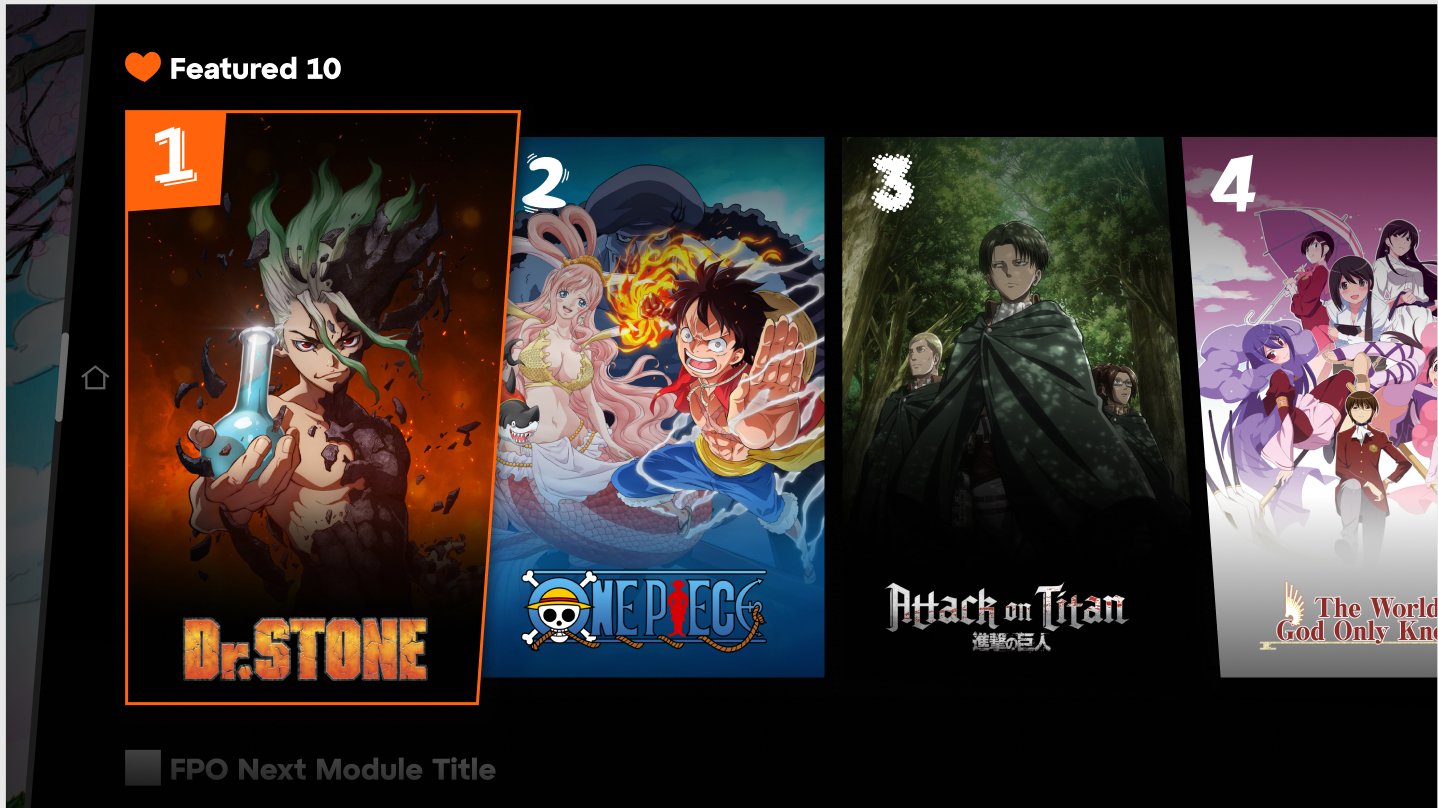
Featured 10
Editor's Pick
Award-Winning
Just Dropped
Must Watch
✦
Behavioral
User state driven
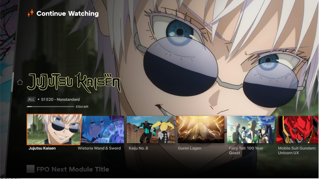
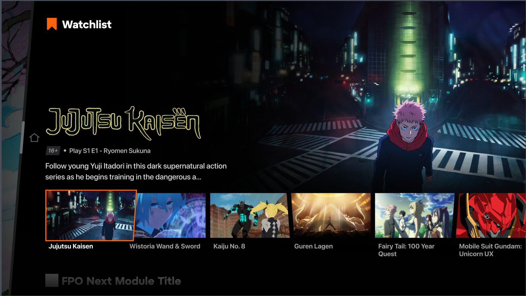
Continue Watching
Watchlist
History (Profile)
✱
Algorithmic
Recommender personalized
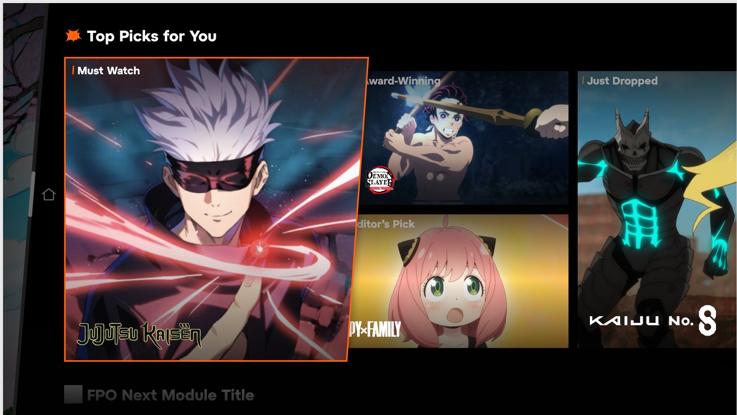
Top Picks for You
Because You Watched
More Like This
▲
Time-bounded
Event driven
Season Premiere
Live
Livestream
New on Crunchyroll
What the taxonomy unblocked
Content Engagement adopted the four buckets as their internal collection-logic spec. Editorial knew which rails they owned. Engineering knew which copy fields were dynamic. Localization knew which strings needed translation versus which surfaced from user state. One artifact, four teams unblocked.
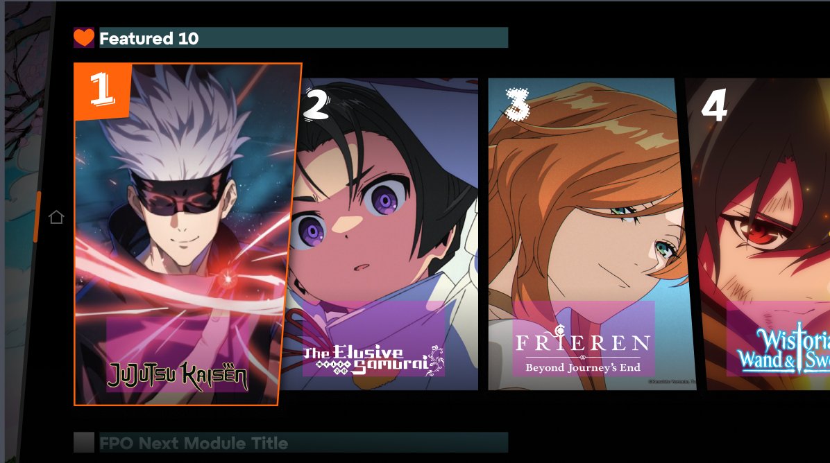
Editorial in practice: Featured 10 earns its number.
Vertical poster art. Hand-drawn 1, 2, 3 numbered ranking. The contract: when an editor cannot fill the rail, the rail does not render.
Algorithmic fill was the proposed fallback because it kept the surface from looking incomplete. The rule against it kept the surface honest. A rail labeled "Featured 10" backed by a recommender is just a Top Picks pretending. The cost of the missing rail (a small visual gap) is lower than the cost of the broken promise (a member who learns Featured isn't actually featured).
Fig. 08bFeatured 10 / variant. Same pattern, different editorial cut
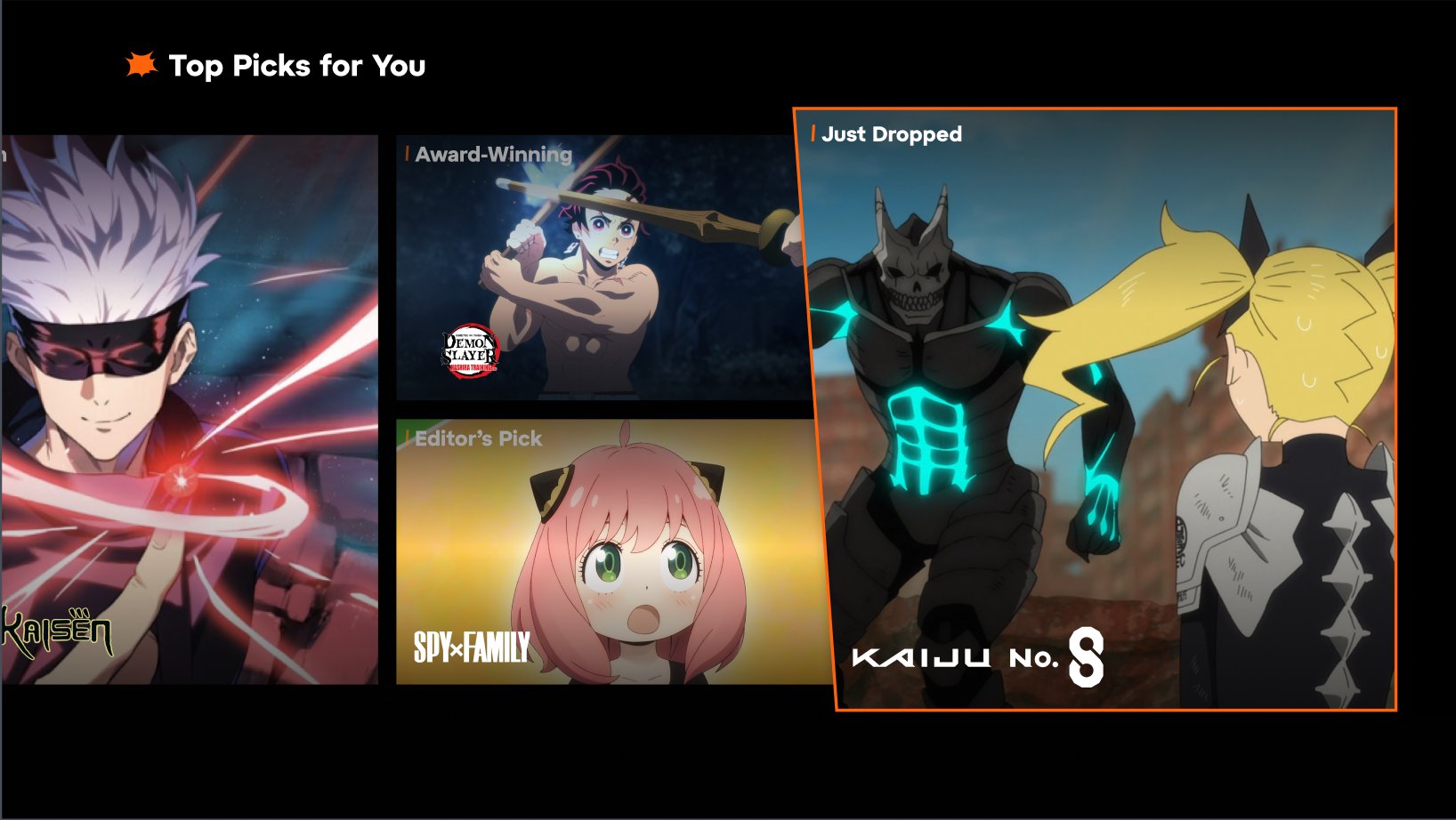
Algorithmic: Top Picks hands off to editorial language.
Recommender-driven container, editorial sub-tags inside tiles (Must Watch, Award-Winning, Editor's Pick, Just Dropped). The recommender chooses the show. The editor labels it.
Behavioral: the surface acknowledges what you did.
Continue Watching uses fan grammar back at fans: S1 E20 Nonstandard · XXm left. Anime fans say exactly that. The interface uses their language directly.
Time-bounded: the system that knows when something is happening.
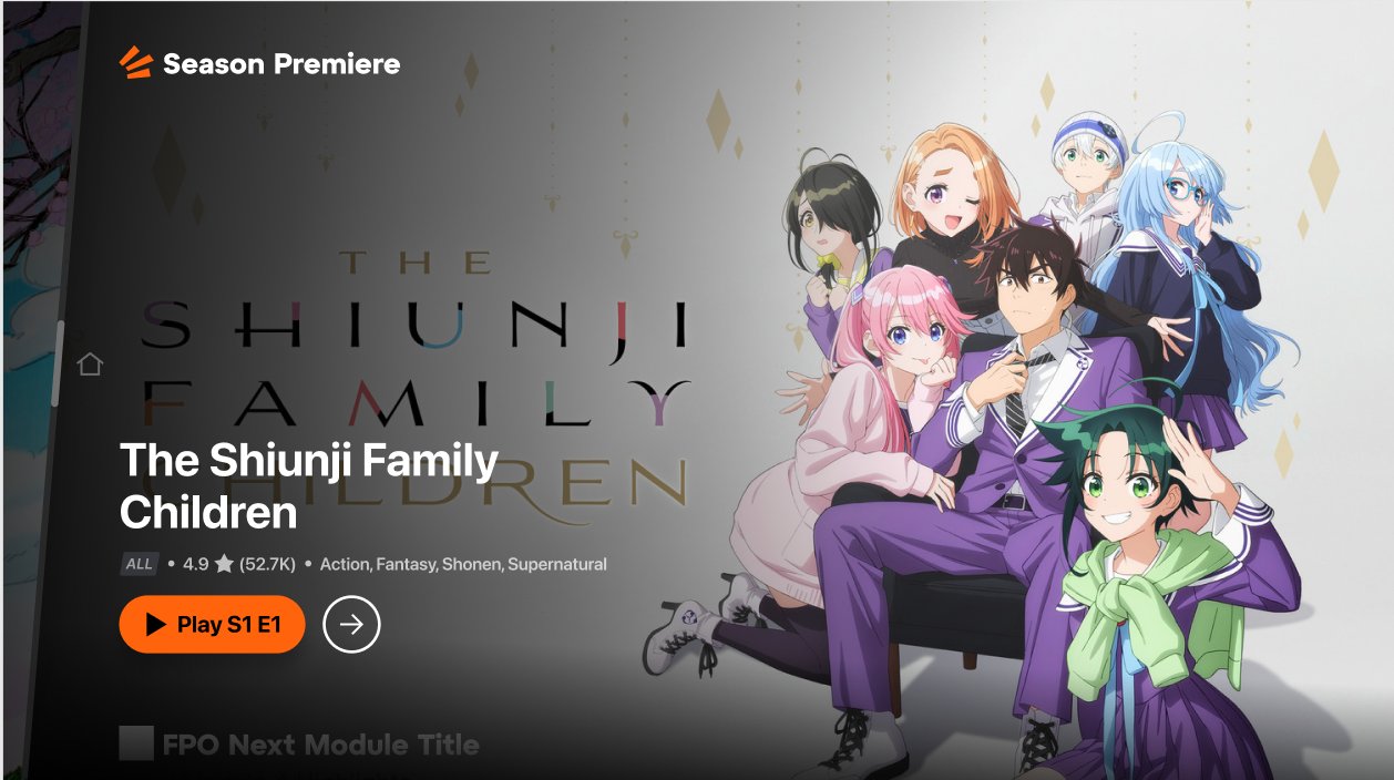
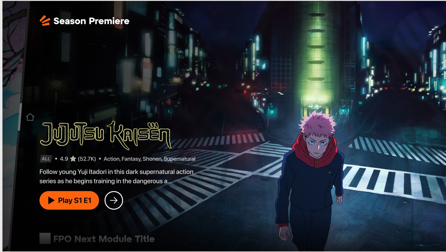
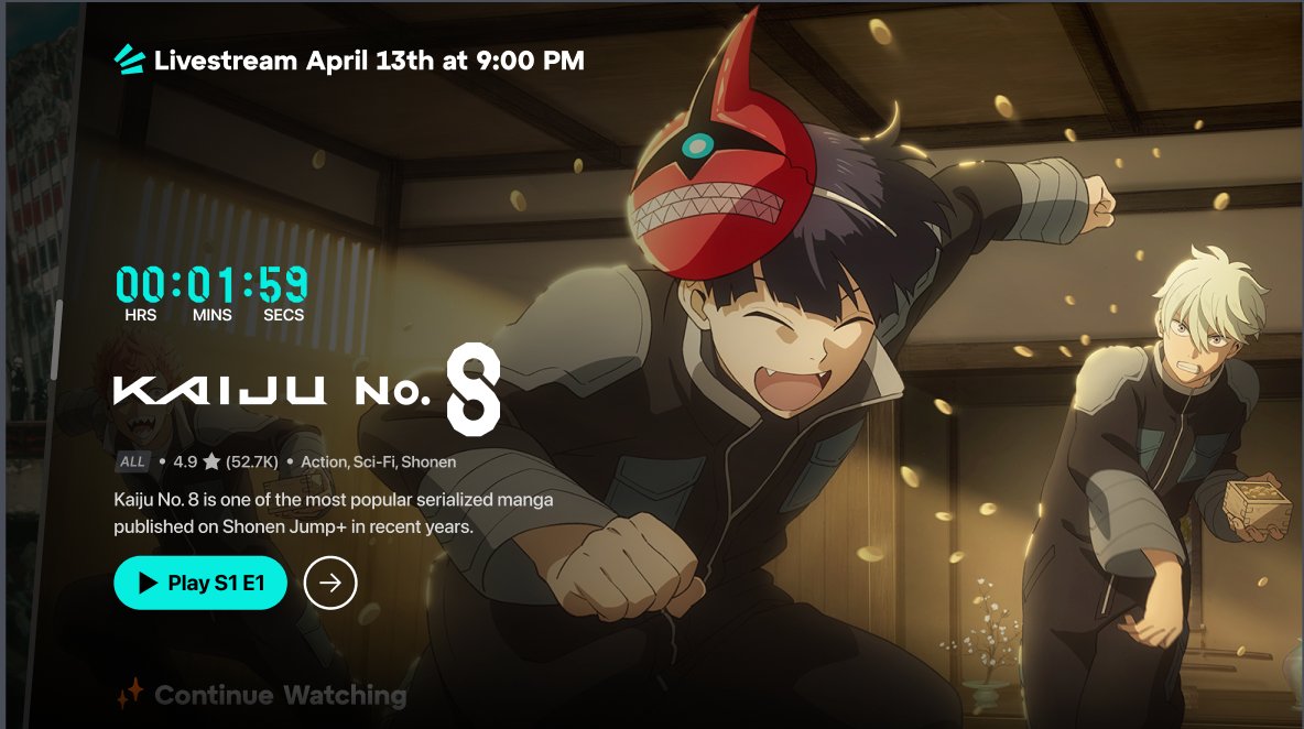
Season Premiere card pattern: stylized show title type, rating + fan score + genre tags, two-line synopsis, Play S1 E1 primary CTA. The pattern holds across light, dark, urban, pastel art.
Fig. 11aSeason Premiere / light. Same pattern, soft palette
Fig. 11bSeason Premiere / dark. Same pattern, urban palette
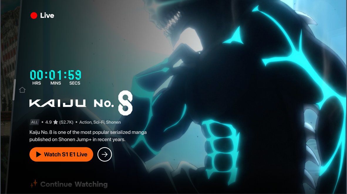
Live and Livestream get a distinct CTA color register: cyan for pre-event, red-dot indicator when broadcasting. The color carries the time-state signal so the user does not have to read the CTA copy to know whether the event has started.
The choice tracks UXR's finding that members on TV scan for color and motion before they read text on a 10-foot surface.
The single-show pattern was the diagnosis. The four-bucket taxonomy is what the home uses to earn the next click. Each rail family does a different cross-discovery job:
Editorial answers what's worth my attention this week? Featured 10 and Editor's Pick are the breadth signal. A human said this is the next show.
Algorithmic answers what would I like that I haven't found? Top Picks hands recommender output to editorial language so the reco reads as a recommendation, not a guess.
Behavioral answers where was I? Continue Watching uses fan grammar so the surface respects the user's place in their anchor show without trapping them in it.
Time-bounded answers what's happening right now? Season Premiere, Live, Livestream, and New on Crunchyroll turn the schedule into a reason to return inside the simulcast week.
A member who came for Jujutsu Kaisen now lands on a home where Editorial is recommending Frieren, Algorithmic is positioning Spy x Family near their preference cluster, Behavioral is saving their place in JJK, and Time-bounded is showing what airs from Japan tonight. The single-show pattern stops being the only path through the surface.
The metadata hierarchy was strict, and one rule inside it took three review cycles to land.
The metadata schema landed as a strict hierarchy:
Identity at the top (Tag, Title).
Evaluative in the middle (Rating, Fan Score, Genre tags).
Narrative at the bottom (Description, Synopsis).
Every field has a documented source (system, editor, recommender, third-party catalog) so localization, engineering, and editorial all know who owns what.
The contested rule: no description while video plays
The rule that took three review cycles to land was about temporal hierarchy, not spatial: while the video preview is playing, description copy does not render.
Eye-tracking work the design team had run on the previous surface showed members sampling the moving image first and ignoring static copy underneath. The description was load on the page that nobody was reading. Cutting it during playback recovers attention for the thing the description was meant to support, and the description returns the moment the preview pauses or loses focus.
Fig. 13Module metadata / spec. Restraint as a rule
The conversion screen earned its sale in four lines.
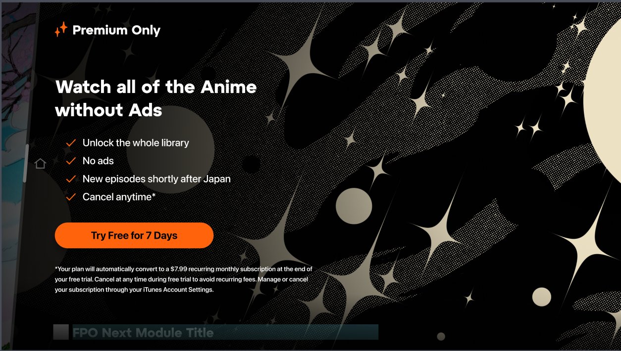
Premium Only is the most visual frame on the surface and the highest-stakes copy decision in the flow. Four lines, in priority order, each answering a different objection:
Unlock the whole library. Scope: what you get.
No ads. Quality: what stops.
New episodes shortly after Japan. Timing: what the audience is buying.
Cancel anytime. Permission: what reduces commitment cost.
The order matches the order objections surface in conversion research: scope first, friction second, timing third, escape hatch fourth.
The third line was contested
Marketing wanted: "Same-day simulcast."
Legal wanted: "Episodes available within hours of Japanese broadcast."
What shipped: "New episodes shortly after Japan."
Both alternates were accurate. Both translated badly to the audience the line was written for: a member following the manga, refreshing forums, trying to stay ahead of spoilers. "Shortly after Japan" matches the mental model the audience already uses ("did Japan air it yet?") and lets the fan complete the sentence in their head ("…so I can watch before I get spoiled").
Marketing approved it after the workshop. Legal approved it because the temporal claim was looser than what they had drafted, not tighter.
Fig. 14Premium Only / conversion screen. Four lines, defended individually
The profile became a fandom identity, not a settings page.
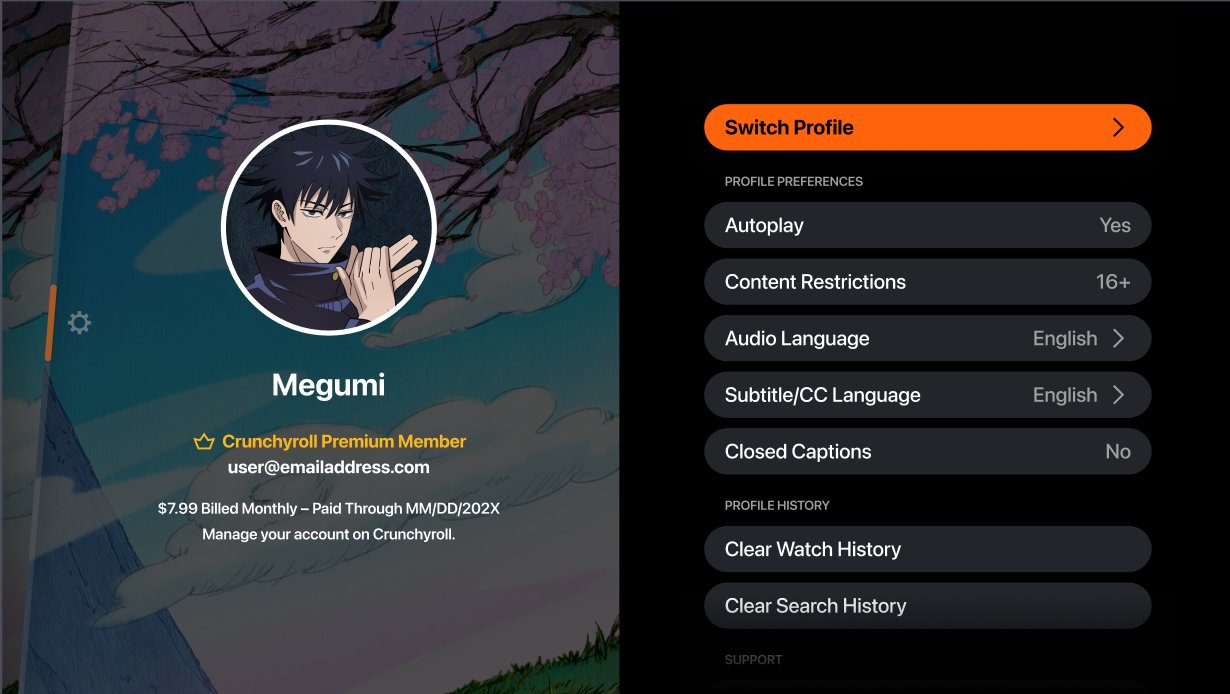
Avatar is an illustrated anime character (Megumi from Jujutsu Kaisen). Subtitle/CC Language and Audio Language are promoted to top-level profile preferences. Previous architecture buried both three taps deep in playback settings.
UXR had flagged sub/dub as the single most-changed default in the player on first session. The signal: members were treating sub-versus-dub as an identity declaration; the IA was treating it as a per-show playback choice. Promoting both to profile-level matched the mental model and removed the most repeated micro-task from the playback flow.
Fig. 15Profile / fandom identity. Avatar as character, sub/dub promoted
The practice grew up alongside the surface.
Six artifacts left the content design seat and showed up in other teams' workflows:
A taxonomy that became a spec.
A metadata hierarchy that became a contract.
A rule set that became a decision tree.
A localization framework that became a market spec.
A workshop methodology that became a brand-voice template.
A measurement rubric that became the data team's per-module performance model.
The shape of the work shifted from one writer authoring strings to one practice handing other teams the artifacts they needed to ship aligned.
Practice artifacts / Six things that traveled the org
A1
Module Taxonomy
→ Content Engagement
Editorial / behavioral / algorithmic / time-bounded. Their collection-logic spec.
A2
Metadata Hierarchy
→ Engineering
Required fields, optional fields, lifecycle rules. Their field-spec contract.
A3
Editorial vs Dynamic Rules
→ Editorial
Decision tree for human-written versus system-generated copy at rail and tile levels.
Before this work, every rail rolled up to one engagement metric. The taxonomy unblocked a more honest model. Editorial measures on lift (curated entry vs algorithmic baseline, matched cohort). Behavioral measures on re-engagement. Algorithmic measures on banded CTR with a confidence-tier baseline. Time-bounded measures on attendance and post-event retention. Before this, the team could not answer "is editorial outperforming the recommender?" After, they could.
● Adoption log / Where the practice traveled5 teams
Content Engagement
Adopted the taxonomy as their collection-logic spec. Adopted the measurement rubric as their per-module performance framework.
Editorial
Adopted editorial-rail rules end to end. Each rail has a documented owner and copy-pattern template.
Brand
Adopted the copy workshop methodology as the template for brand voice / product copy alignment.
Engineering
Built field-spec implementation against my documentation: welcome, modules, metadata, fallbacks.
Localization
Adopted bilingual welcome spec across 25+ markets. JST anchoring and truncation hierarchy treated as immovable.
The aesthetic was a co-creation. The system that let it travel was the content layer. Both shipped at the same time, and neither would have held alone.
Closing reframe / End of Chapter 03
Chapter 04 · What landed
The direction got approved, the practice matured, and the system shipped at scale.
1
Founding vision greenlit, CEO + senior leadership
4
Module families codified into the taxonomy
25+
Markets running on one bilingual welcome system
6
Practice artifacts shipped, adopted by 5 internal teams
Three signals confirmed the work had taken hold beyond the rebrand itself:
Vision approved at the executive level. Manga-forward direction and Hime as AI search character both cleared CEO and senior-leadership review. The taxonomy was what won the room. Specificity could be defended because the system underneath made specificity scalable across 25+ markets.
Practice matured into shared artifacts. Six artifacts shipped as operating-system pieces for content work: taxonomy, metadata hierarchy, editorial-vs-dynamic rule set, bilingual welcome spec, copy workshop methodology, measurable-impact rubric. Five teams adopted them. Mobile and web roadmaps reused the artifacts without the original author in the room.
Measurement framework established. Each module family ships against its own axis: editorial on lift, behavioral on re-engagement, algorithmic on banded CTR, time-bounded on attendance. Leadership can answer "is editorial outperforming the recommender?" for the first time, which makes content design a defensible line item in the next planning cycle rather than a discretionary investment.
Note on business metrics. Engagement, retention, and conversion outcomes are confidential to Crunchyroll and intentionally omitted. Figures above are operational and adoption signals defendable with documentation.
Reflection
Three moments that moved the org.
◈ Reflection / 01 The research signal that won the executive room
UX Research surfaced one finding that reframed the AI search question for the whole org: fans carried a parasocial relationship with Hime that no other anime brand could replicate. That research-backed signal turned a generic voice interface into a search character with personality, gave brand and product a story they could rally behind, and gave executive leadership a strategic decision they could greenlight: specific to the brand, defensible across markets, grounded in real user behavior.
◈ Reflection / 02 The taxonomy that empowered five partner teams
The four-bucket module taxonomy started as a content artifact and ended as the shared operating system between Content Engagement, Editorial, Engineering, Localization, and Brand. Each team got back the vocabulary their work depended on: Content Engagement got a collection-logic spec, Editorial got rail ownership, Engineering got dynamic-versus-authored field rules, Localization got translation boundaries, Brand got a workshop methodology that pulled brand voice into product copy. Five teams could ship aligned because the architecture handed them their craft, with the room to apply it.
◈ Reflection / 03 The measurement that earned the business case
Every rail had been rolling up to one engagement metric, which let the org argue but not decide. The taxonomy unblocked a more honest model, built in partnership with the data team: editorial measures on lift, behavioral on re-engagement, algorithmic on banded CTR, time-bounded on attendance. Leadership could finally answer whether editorial was outperforming the recommender, and where to invest next. The rebrand turned content design from a surface decoration into a defensible business surface, in a market where the catalog moat was disappearing and the audience needed a reason to stay that competitors couldn't replicate by buying licenses.