Discipline
Content design,
information architecture
Initiative I led
Content strategy for the
Marketing Analytics redesign
Reported to
Garcia,
UX Manager
Surfaces shipped to
Marketing homepage, sidebar IA,
Attribution, Campaigns, Automations
The brief
Shopify Marketing Analytics had a 12% adoption rate. The merchants were capable. The interface had been built for a different question than the one they were trying to answer.
The diagnosis
Merchants opened Marketing Analytics, struggled to find the answer to "should I increase Facebook spend," and closed the tab. The numbers were technically correct, but Shopify's ROAS didn't match Google's or Meta's because each platform calculates differently, and nobody had explained that. So the merchants assumed the numbers were wrong, which left the tool feeling unreliable on top of being hard to navigate.
Why it mattered
The merchants Marketing Analytics was supposed to serve were running real ad budgets and making real allocation decisions every week. As long as the tool stayed unusable, they reconciled their numbers in spreadsheets and trusted other platforms more than they trusted Shopify. That meant Shopify was losing influence on the highest-leverage decision merchants make.
What I did
I built three foundational artifacts: a cross-platform terminology audit, a workflow map from a 12-merchant shadowing study, and an internal alignment workshop that broke a six-month definition stalemate between engineering and marketing. From those, I designed three content strategy shifts and a three-part tooltip pattern that other teams later adopted on their own surfaces.
The work
From a 12% adoption reporting tool to a 28% adoption decision-making system.
Six chapters: the four problems that surfaced in research, the merchant spectrum that shaped the architecture, the three artifacts that aligned the org, the structural redesign, the three content shifts inside it, and the tooltip system that scaled across the org.
Chapter 01
Here's why merchants weren't using Analytics.
The initial framing inside the org was that merchants lacked analytics sophistication. User interviews said something different. The merchants were capable. The interface was the problem, and four overlapping causes made the tool feel both unreliable and unusable at the same time.
The merchants knew their numbers didn't match Facebook's or Google's, and that loss of confidence cost them real decisions every week. The interface organized data by technical category instead of by the questions merchants needed answered.
Chapter 02
Merchants sit on a sophistication spectrum, and the interface had to serve both ends.
The same product had to serve two fundamentally different users, and that tension shaped every content decision that followed. On one end was a marketing expert from South Africa running a jerky brand with a roughly $30K monthly budget across Facebook, Instagram, and Google Shopping. On the other was a first-time entrepreneur from Toronto selling handmade jewelry, who would open the analytics tab and immediately close it because the tool felt like it was for someone else. Progressive disclosure became the architectural answer that let both audiences see what they needed without overwhelming either.
Marketing expert
$30K/month, multi-platform
Uses three or more analytics tools simultaneously and reconciles in spreadsheets. Wants Shopify to unify the campaign view, let her compare attribution models, and show the methodology behind the numbers so she can trust them.
- Unify campaigns in one view
- Compare attribution models
- Automate budget decisions
- Show the math
First-time entrepreneur
Just getting started
Opens analytics, closes the tab. Cannot interpret the numbers. Feels the tool is "not for people like me." Wants to be told what to do next, given templates, and shown benchmarks so the path is obvious.
- Tell me what to do next
- Give me templates
- Show me benchmarks
- Make the path obvious
Surface-level metrics had to be glanceable, detailed breakdowns had to be on-demand, and calculation transparency had to live in tooltips. The goal was for both audiences to be served at the same time without either of them noticing the other was there.
Chapter 03
Three artifacts aligned the org around a shared problem.
Before any redesign could ship, the organization needed to share an understanding of the problem. Engineering wanted platform-specific metric definitions to match backend logic, marketing wanted merchant-friendly simplifications, and the two had been at a stalemate for six months. I built three artifacts in sequence, each one designed to break a different deadlock.
Artifact 01 / Cross-platform terminology audit.
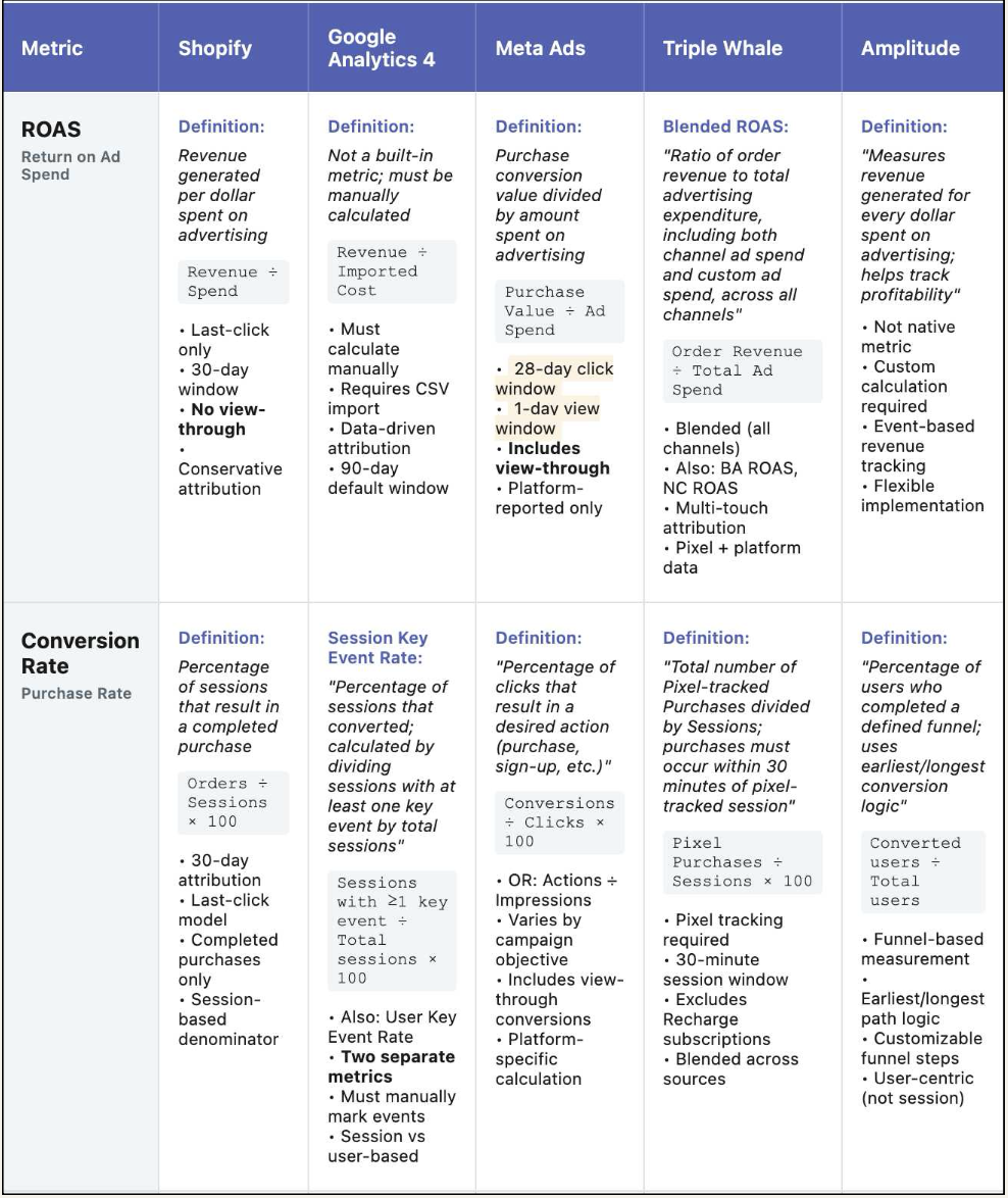
Merchants reported attribution discrepancies between Shopify and other platforms, and engineering's first instinct was to suspect bugs. Leadership's first instinct was simplification, which would have hidden the problem instead of resolving it. I tracked down teams who had worked on marketing analytics historically, reviewed their journal entries, and partnered with content designers on adjacent product spaces to map the holistic merchant journey. That uncovered the real finding: platforms calculate differently, and obscuring this creates false precision.
I audited Google Analytics 4, Meta Ads, Triple Whale, and Amplitude documentation alongside Shopify, comparing how each platform defines ROAS and Conversion Rate. The differences were substantial. Shopify used last-click attribution with a 30-day window. Google used a 28-day click window with view-through. Meta included view-through conversions Shopify didn't count. Triple Whale blended all channels including non-campaign revenue. The discrepancies were methodology differences.
I presented findings to product leadership and proposed transparency over simplification. Leadership initially resisted exposing formulas because they were worried about overwhelming merchants. I proposed phased testing with power users, which proved adoption increased when merchants could see the math. That reframed our content strategy from hiding complexity to exposing calculation logic, and it influenced tooltip implementation and metric definition standards across all marketing products.
Artifact 02 / Merchant workflow maps.
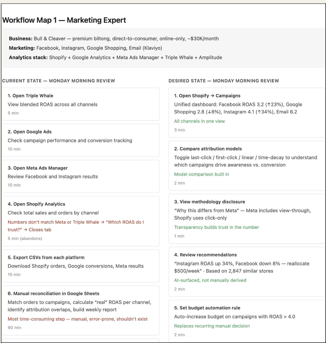
Initial framing positioned merchants as lacking sophistication. User interviews suggested the interface structure didn't match decision-making workflow. I partnered with data scientists for instrument tracking, with engineering to validate technical feasibility, and with product managers across Campaigns, Attribution, and Automations to align on roadmap implications. Then I designed a shadowing study with twelve merchants, documenting their Monday morning marketing review step by step.
The current state was brutal. A marketing expert's weekly review opened Triple Whale for five minutes, then Google Ads for ten, then Meta Ads Manager for ten, then Shopify Analytics for five before abandoning because the numbers didn't match, then exported CSVs from each platform for fifteen minutes, then spent ninety minutes reconciling everything in Google Sheets. That was over two hours for a question that should take three minutes: where should the money go this week.
I synthesized the shadowing findings into six workflow principles that prioritized comparison over trends and single-screen budget decisions. I presented the analysis to the VP of Product and demonstrated that incremental UI changes could not resolve a structural misalignment. The team's scope shifted from surface improvements to a full information architecture redesign, which informed the sidebar restructure and homepage prioritization that followed.
Artifact 03 / Internal alignment workshop.
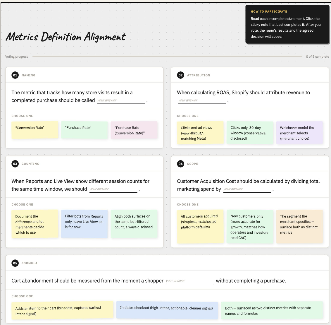
The cross-team audit revealed a deeper problem: engineering, data science, and marketing teams calculated and perceived the same terms differently, and merchant-facing definitions could not be consistent until internal teams agreed on a source of truth. I proposed and facilitated an alignment workshop with technical leads, data scientists, and product managers to break the six-month stalemate.
I anchored the workshop around merchant confusion quotes pulled from the shadowing study, which shifted the conversation from "what is technically accurate" to "what prevents merchant errors." That reframing broke the deadlock. We reached consensus on a shared definition matrix covering 23 core metrics, with standardized scope, exclusions, and attribution models for each. The artifact became the reference standard for feature development and tooltip implementation, and other teams started using it as a template for their own alignment processes.
A note on what shifted
As Garcia, the UX Manager, framed it: the value of the work was less the artifacts than the story they made possible, a story strong enough that the team could see what was being done and what needed to be done next. The artifacts gave the org a shared way to see the problem, which is what unblocked the redesign that followed.
Chapter 04
The structural redesign moved Attribution into the workflow.
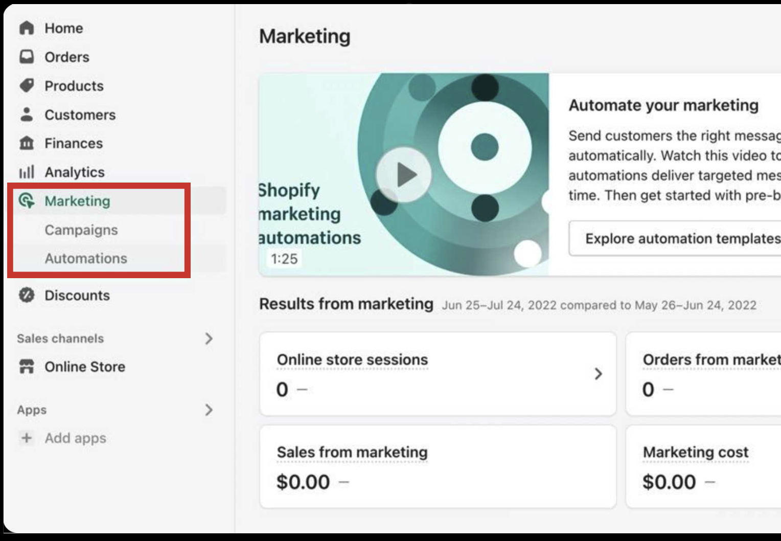
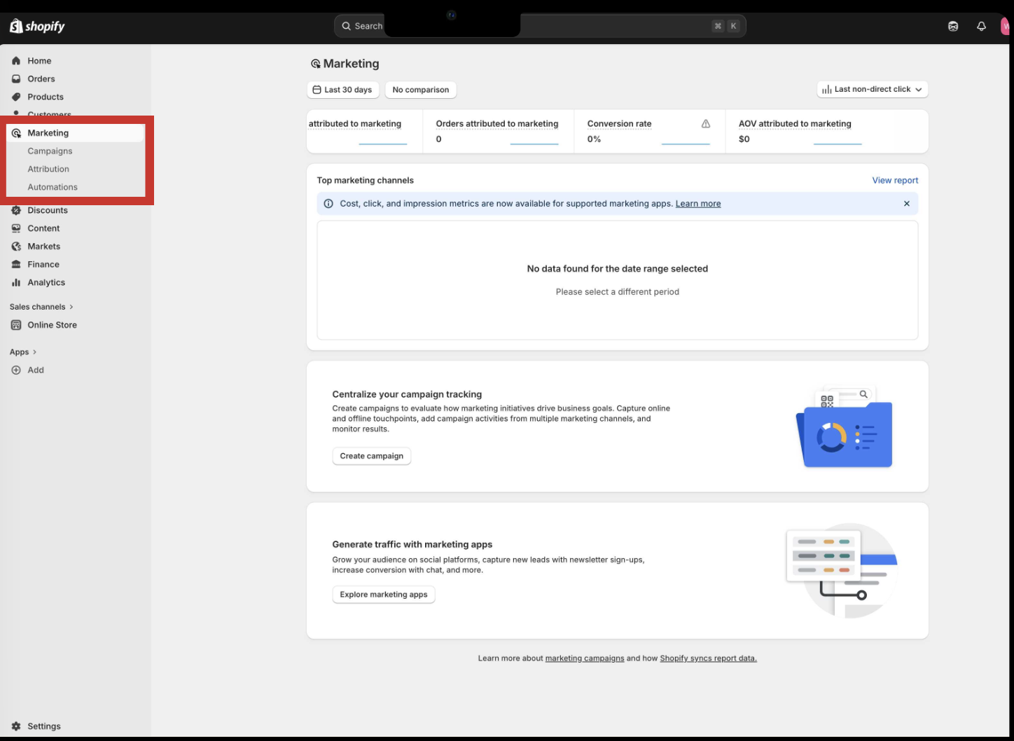
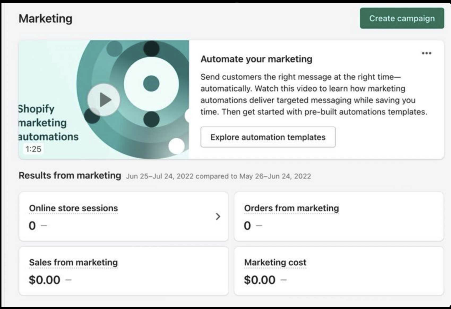
With the org aligned on the problem, the redesign had two structural moves to make first. The sidebar treated marketing as a binary of "create campaigns" and "automate workflows," which left attribution buried three clicks deep under Analytics. The homepage prioritized educational content like video tutorials over performance data, which made the page feel like an onboarding flow instead of a workspace. Both choices made the tool feel unable to support real marketing operations.
Sidebar: elevating attribution.
Workflow mapping had revealed that merchants operate in continuous loops: launch campaign, check attribution, adjust budget, repeat. The previous interface forced context switching across separate navigation sections, which broke that loop every time. The redesigned sidebar elevated Attribution to equal hierarchy within Marketing alongside Campaigns and Automations, eliminating the four-click detour. Discoverability directly drove engagement: Attribution page visits increased 43% post-launch.
Homepage: performance data above the fold.
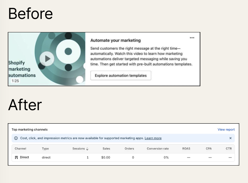
The previous homepage prioritized educational content like video tutorials and feature explanations over performance data. That created a dual problem. Experienced merchants saw the prominence of onboarding content and questioned whether the platform could support sophisticated operations, while inexperienced merchants felt overwhelmed by choices before they understood their own performance baseline. Both audiences needed performance first and education second.
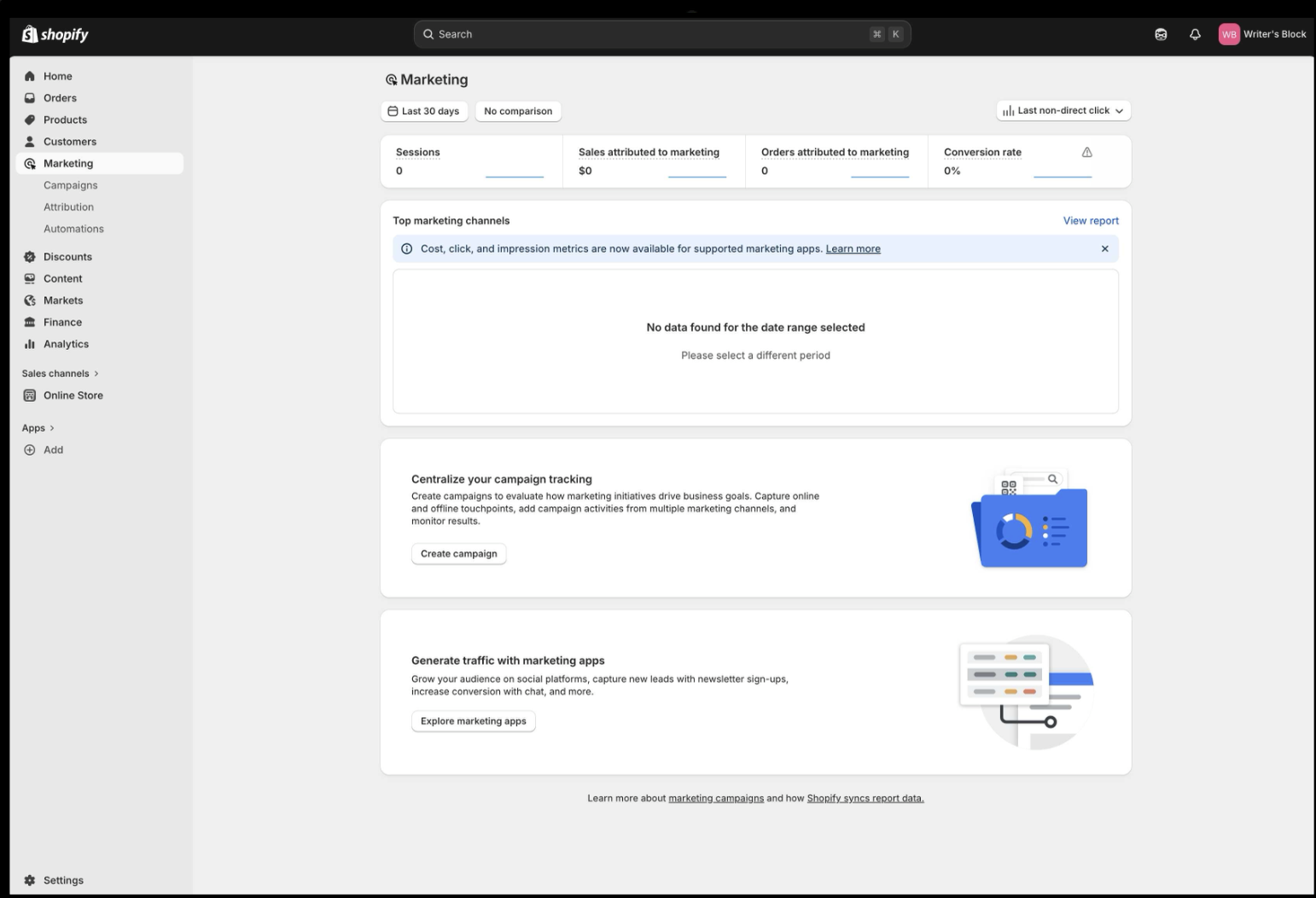
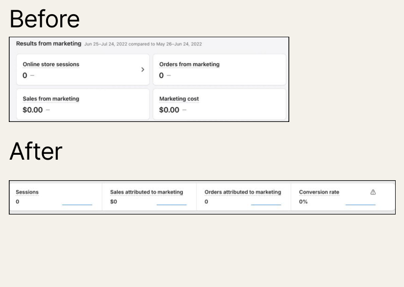
I proposed repositioning educational content to email campaigns and help documentation, where merchants could engage on their own time, and using the above-the-fold space for glanceable metrics. The redesigned homepage now prioritizes Sessions, Sales attributed to marketing, Orders attributed to marketing, and Conversion rate. The "Top marketing channels" report became the primary workspace element, eliminating the detour to Analytics and surfacing attribution where spending decisions happen.
Moving educational content from in-product to email campaigns wasn't a demotion. Click-through on the educational emails was 34% higher than in-product placement, because merchants want to learn on their own time, not when they're trying to decide where to spend money.
Chapter 05
Three content shifts redefined what the interface was for.
The structural changes to sidebar and homepage created the container. The content shifts that follow defined what went inside it. Each one represents a deliberate reframing of how the interface communicates with merchants, and each one was scored by whether it helped a merchant get closer to a decision they were trying to make.
Shift 01 / Feature → Task.
The previous homepage centered Shopify's features rather than merchant objectives. I reframed the primary content module as "Top marketing channels," which shifted the emphasis from what Shopify can do to what merchants need to accomplish. Merchants who saw the new module said it finally showed them what they came for, instead of asking them to translate feature descriptions into their own business context.
Shift 02 / Causation → Attribution.
The original labels promised false precision: "Sales from marketing" and "Orders from marketing" implied causation, but reality involved multiple touchpoints across Shopify, Facebook, and Google. A merchant chasing a 35% ROI inside Shopify against Facebook's 38% would assume Shopify was broken. Relabeling to "attributed to marketing" made the calculation visible and let merchants trust the gap between platforms instead of distrust Shopify. The new headlines could now carry tooltips that explained attribution methodology transparently, and "Marketing cost" became "Conversion rate" so the headline measured outcome instead of input.
Shift 03 / Builder → Analyst.
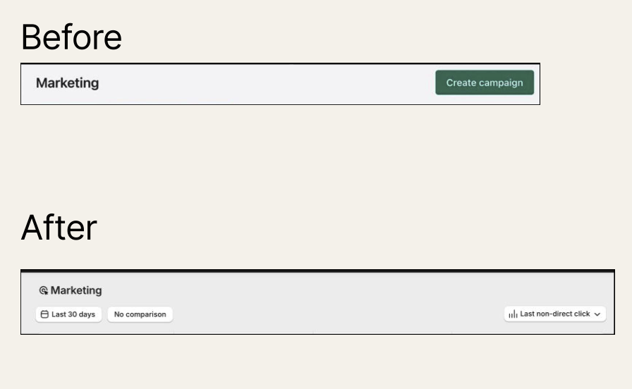
The only top-right control on the previous Marketing homepage was a "Create campaign" CTA. Research showed that merchants arrive wanting to analyze existing performance, not create new campaigns, so the affordances were aligned to the wrong job. The redesigned header now holds a date range selector, a comparison toggle, and an attribution model switcher, all of which acknowledge that campaign analysis happens more frequently than campaign creation. After launch, attribution model switching increased 36%, which signaled that merchants were doing the analysis the affordances now invited.
Chapter 06
I built a tooltip pattern that scaled across the org.
The Campaigns page had to serve expert merchants who needed granular attribution breakdowns and novice merchants who needed foundational metric understanding, and progressive disclosure was the architectural solution. Surface-level metrics had to be visible at a glance, detailed breakdowns had to be on demand, and calculation transparency had to live in tooltips. That let the same page support both "is my marketing working" and "should I reallocate budget from Facebook to Google" without forcing experts through explanatory copy or overwhelming beginners.
Formula tooltips had a scalability problem to solve: how to make complex attribution calculations comprehensible without overwhelming every metric card with technical detail. I designed a three-part pattern that gave each tooltip the same shape, so merchants could read any one of them and trust the next.
Scope
What it measures
Plain language, no jargon. A novice merchant reads this and understands what the number represents without needing a glossary.
Boundaries
What it excludes
This is where trust is built. Naming what is not counted prevents the false precision that eroded merchant confidence in the first place.
Formula
How it's calculated
The exact math, visible on demand. Expert merchants audit it. Novices skip it. Both trust the number more because the math is there at all.
The team applied the pattern across 12 metrics. Other teams later adopted it independently for Attribution reports and Automations tables, which signaled platform sophistication through explicit methodology rather than oversimplified labels. The scaling was the part I cared about, because a content system that only works while the content designer is in the room is a dependency the next product launch will run into.
Adoption more than doubled because the interface finally matched how merchants think about marketing decisions. Three further signals confirmed the system had taken hold:
- Discoverability drove engagement. Elevating Attribution from a buried Analytics page to the Marketing sidebar meant merchants who had never found it now used it as part of their weekly workflow. Attribution page visits increased 43% post-launch.
- Education performed better outside the decision moment. Educational email CTR was 34% higher than the same content in-product, which validated the hypothesis that the homepage should serve decision-making, not onboarding.
- The system scaled without me. The tooltip pattern, the terminology standards, and the metric definitions I created were adopted across Attribution reports and Automations tables by other teams independently, which is the signal that mattered.
Note on metrics. Adoption, engagement, and activation figures are Shopify-internal Q1-post-launch reads on the Marketing Analytics merchant cohort. Structural changes (sidebar, homepage) and content shifts shipped together; the tooltip pattern and terminology audit are the components attributable to content design specifically. Specific cohort sizing and confidence intervals are subject to NDA.
Reflection
This work was about getting merchants to a decision.
Why this matters now
Analytics products tend to fail when teams treat data presentation as the deliverable instead of decision-making as the outcome. Shopify's case was a clear example: the merchants were capable, the interface was organized by technical category instead of by the questions merchants need answered, and the resulting product felt unreliable.
Content design was the lever that turned a 12% adoption reporting tool into a 28% adoption decision-making system, and the leverage came less from better labels than from three artifacts that changed how the org understood the problem and three content shifts that changed how the interface served its users. The cross-functional alignment process, the progressive disclosure architecture, and the metric governance standards transfer directly to any data-dense product surface where users need to make confident decisions.
Up next
Issue №04
I co-shaped Crunchyroll's rebrand from the earliest concepts.
→